
The Small Bath, Fully Considered
A compact bathroom reimagined as a study in precision — where every fixture, tile, and surface earns its place.
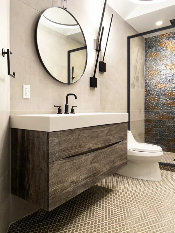
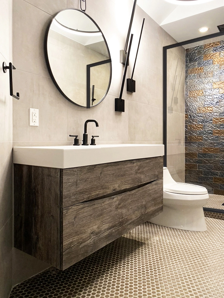
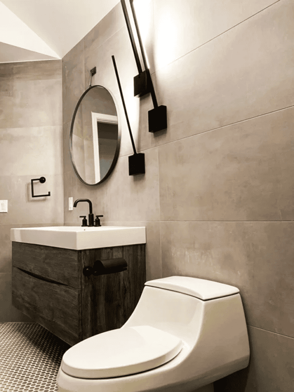
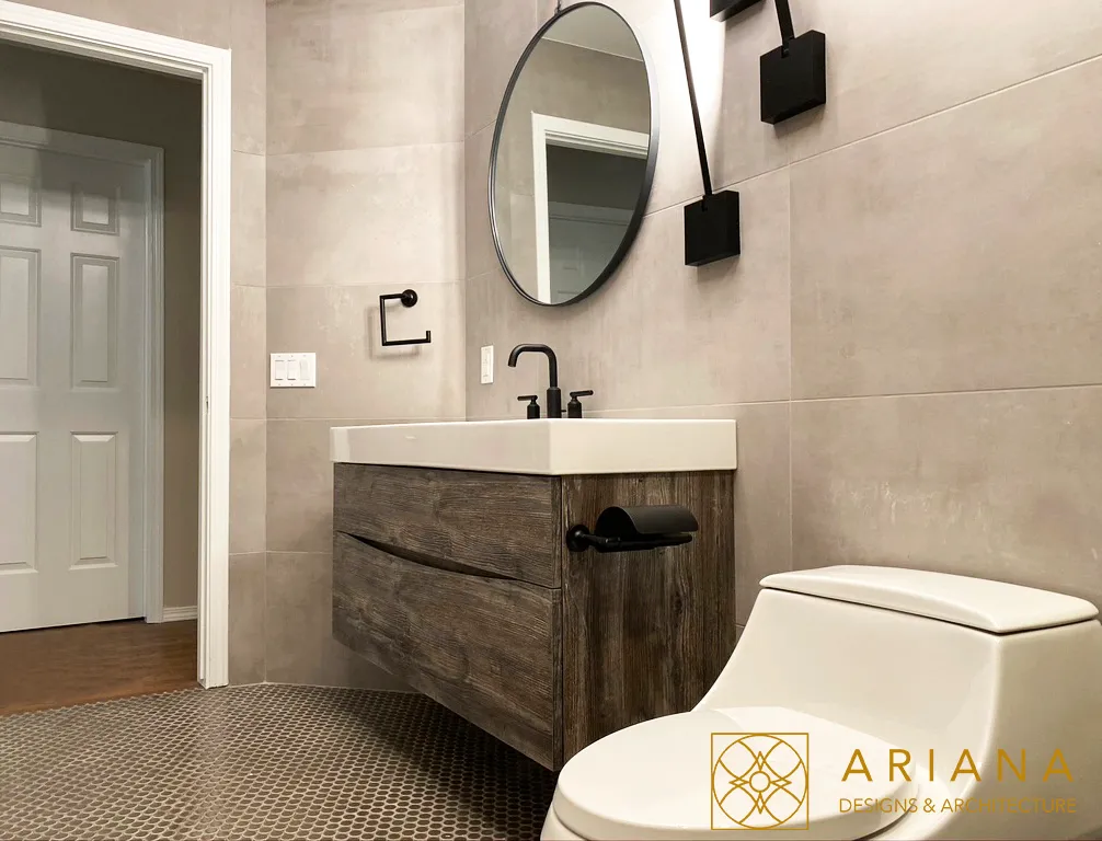
Small bathrooms are where design decisions matter most. There is no room for filler, no space to hide a bad choice. This project took a compact footprint and turned it into something that feels intentional — layered textures, a warm wood vanity, matte black hardware, and tile work that gives the eye somewhere to travel without cluttering the room.
The goal was not to make the bathroom feel bigger. The goal was to make it feel finished. Those are different ambitions, and the distinction shows in every detail.
Designed for Constraint
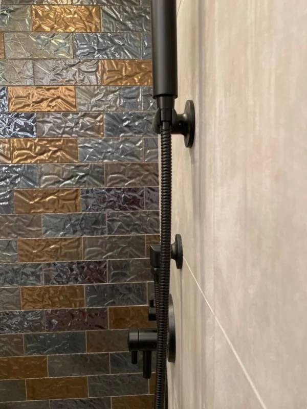
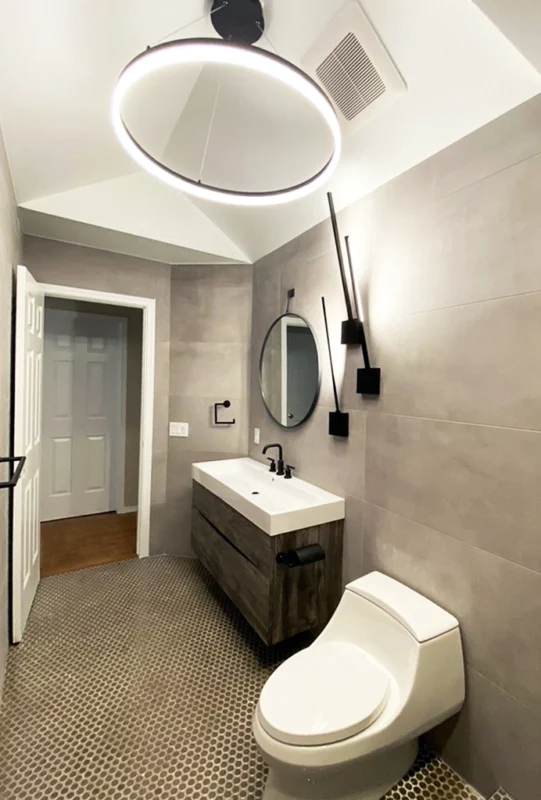
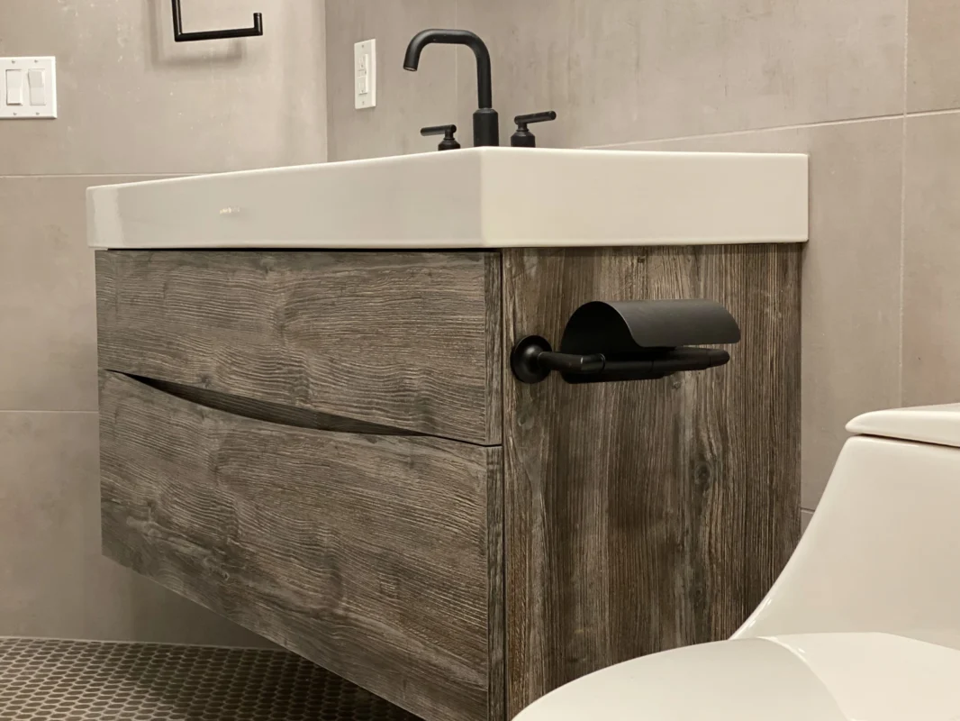
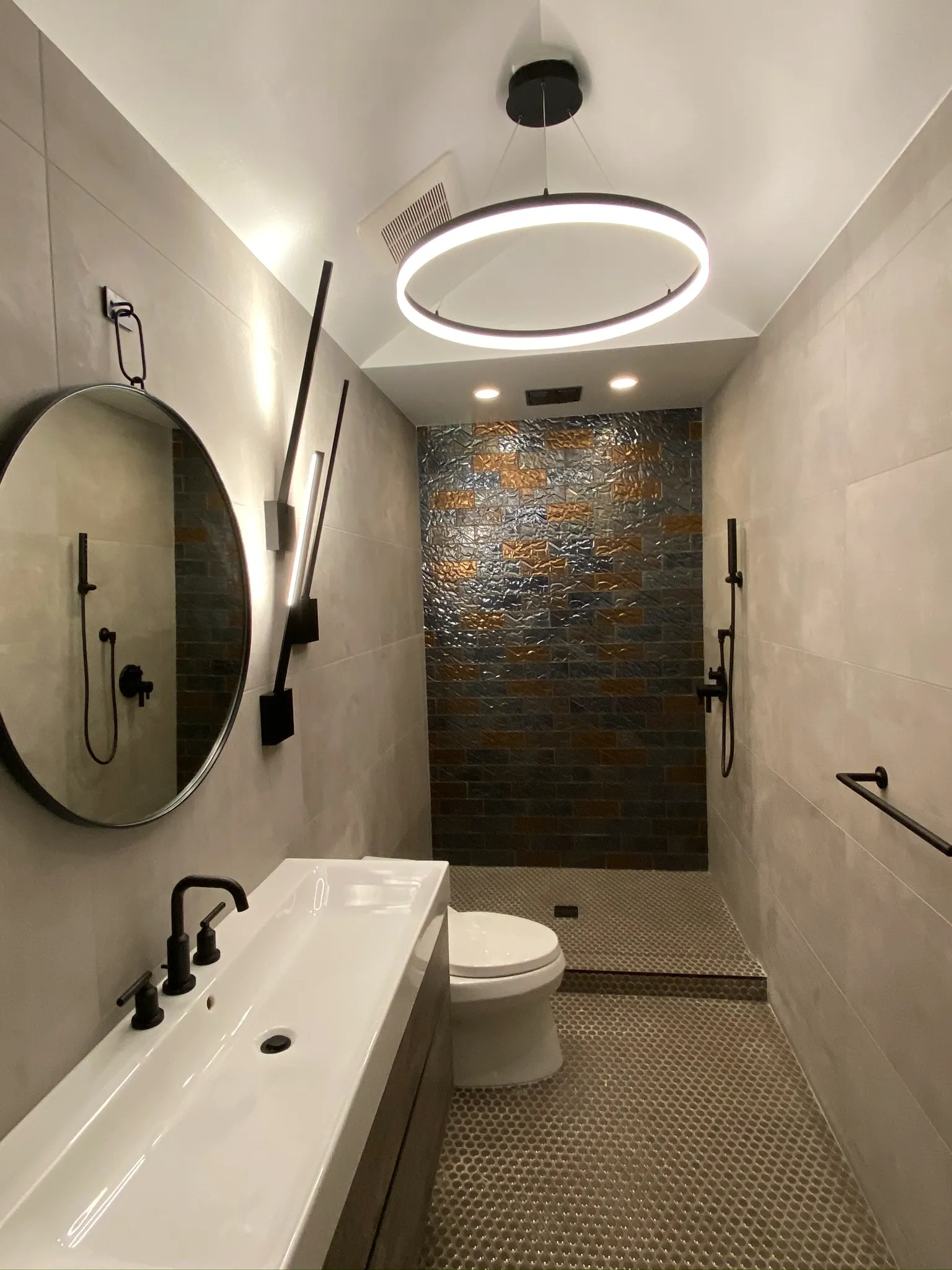
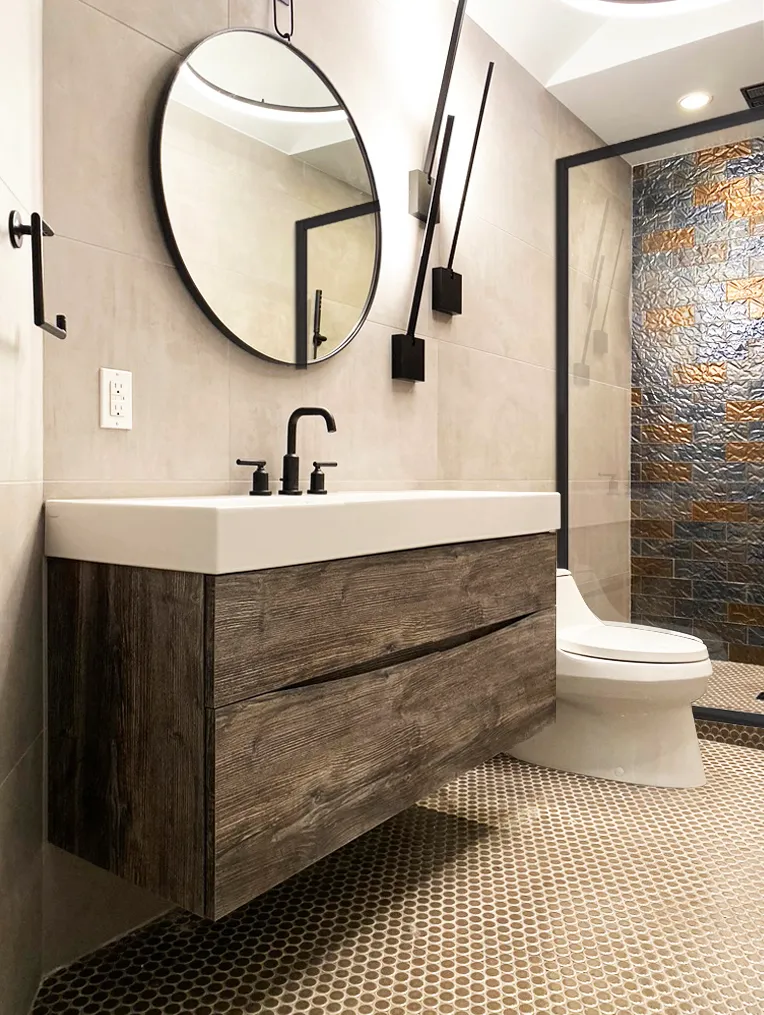
Working within a tight footprint forces a kind of design discipline that larger spaces rarely demand. Every inch was deliberate — from the floating vanity that opens up the floor visually to the textured tile that adds depth without bulk.
The palette stayed tight: gray, warm wood, white, matte black. No accent colors fighting for space. Just materials doing their job well.
The Work Begins With One Conversation
We hold a limited number of consultations each month and are selective about the projects we take on. If you’re ready to discuss yours, we’d like to hear about it.
The Challenge: Small Space, High Expectations
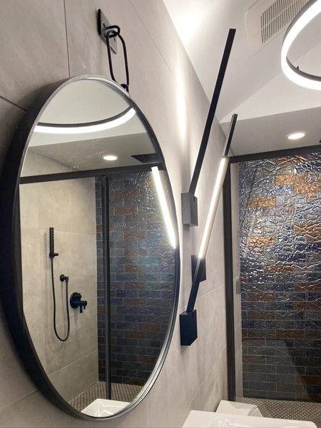
The client wanted a bathroom that felt luxurious without pretending to be something it wasn’t. No fake expansions, no mirror tricks — just a space that was genuinely well-designed.
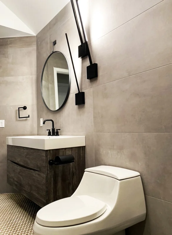
That meant making hard choices: one strong tile pattern rather than two competing ones, fixtures scaled precisely to the room, and lighting that felt warm rather than clinical.
“Small doesn’t mean compromised — it means every decision carries more weight.”
How We Built the Layers
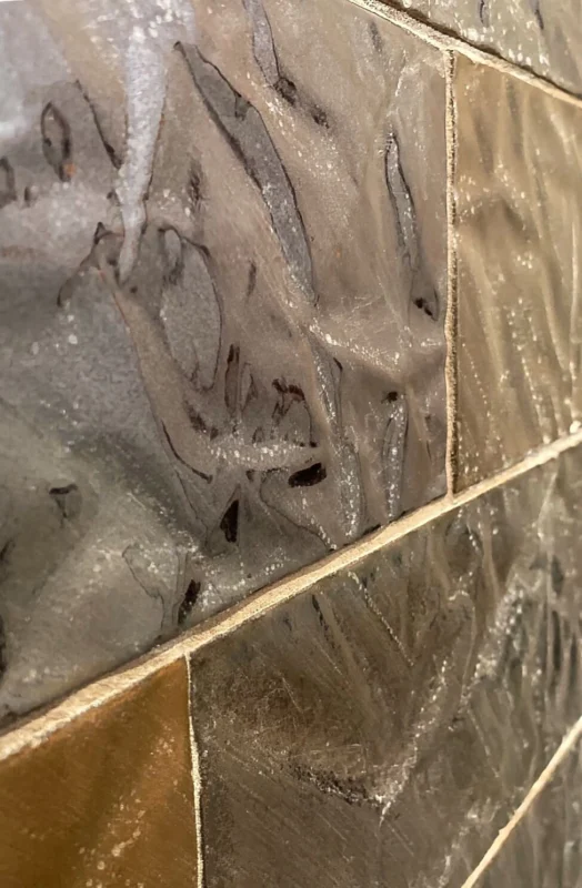
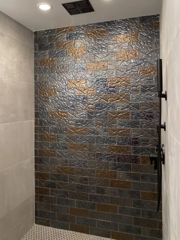
We started with the shower — the functional anchor of any bathroom — and worked outward from there. Hexagonal floor tile, matte fixtures, and a textured wall panel gave the space three distinct material moments without competing.
The vanity was chosen for its warmth. In a room dominated by gray and black, the wood grain pulled everything together and gave the eye somewhere to rest.
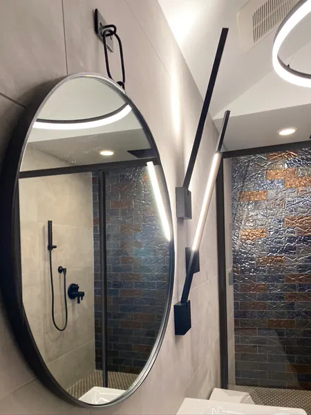
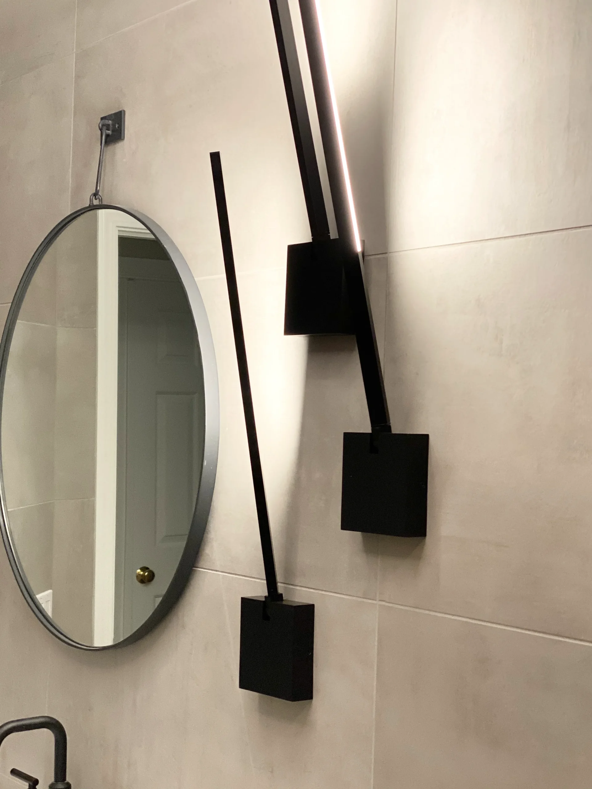
Lighting was the final layer — warm-toned rather than cool, positioned to eliminate harsh shadows and make the room feel calm instead of clinical.
Frequently Asked
The work in this portfolio is the standard we hold ourselves to on every project — not just the celebrated ones.Your home should stop you. Every time you walk in.