
Community in Style: The Beryl Amenity Lounge
A residential amenity lounge designed to feel like a hotel lobby that actually belongs to the people who live there.
A multifamily amenity lounge is a specific brief. The space has to work for residents who use it like a coworking space, residents who want a quiet lobby, and guests who arrive for the first time and need to understand where they are. The design can’t optimize for one person. It has to hold for all of them.
The Beryl Apartments lounge was designed to hotel-grade standard at residential scale. The goal was a room with a clear identity that justified the building’s positioning in the market — and that would still read as intentional a decade from now.


Hotel-Grade at Residential Scale
The aqua and gold botanical wallpaper mural was the defining decision. Applied floor-to-ceiling on the primary wall, the mural gives the room an identity that paint cannot achieve. Aqua and gold hold warmth in Seattle’s gray light without reading as garish under overcast conditions. The botanical pattern reads as current without being trend-dependent.
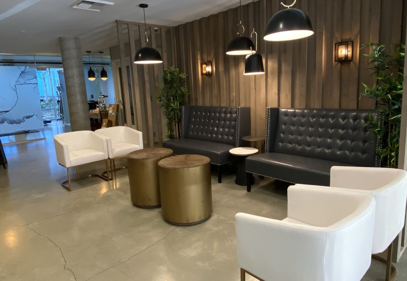
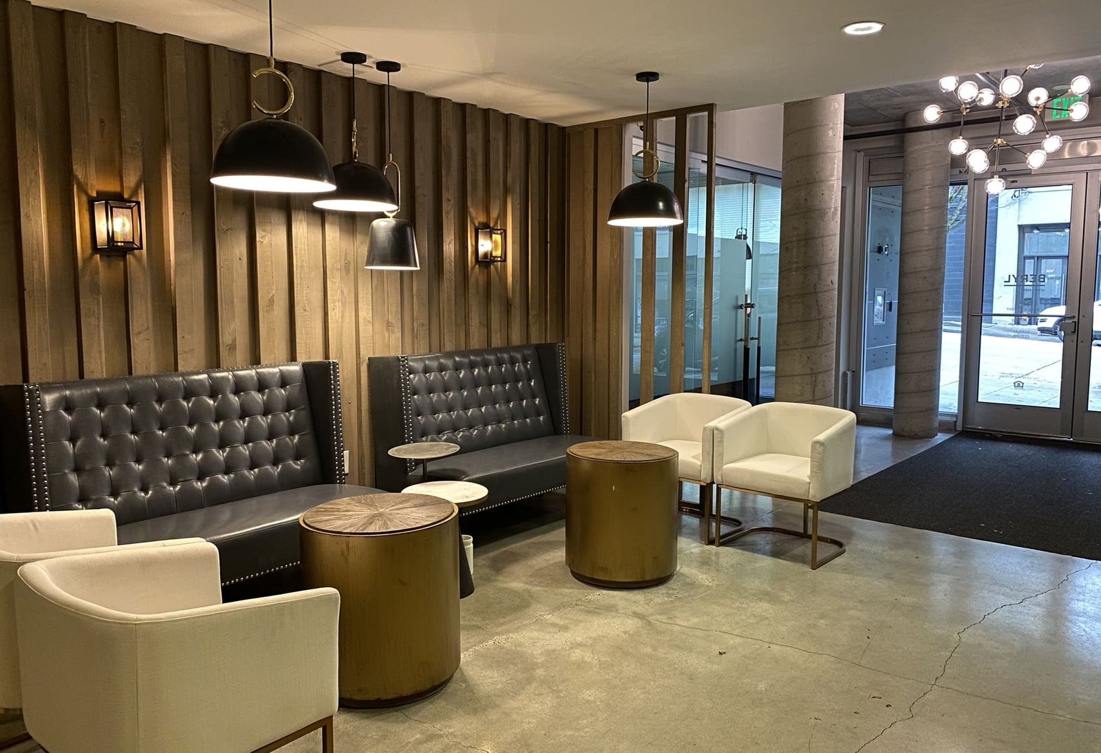
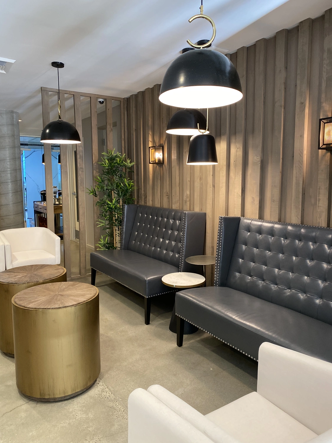
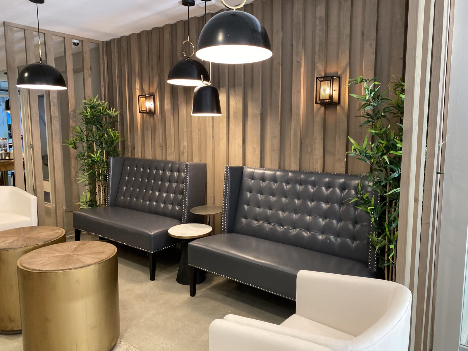
The charcoal tufted sofas are contract-grade construction at residential scale. Tufting is a durability choice as much as an aesthetic one: it holds shape under the volume of use a lounge receives. Charcoal holds against the wallpaper’s palette without competing with it.
The Work Begins With One Conversation
We hold a limited number of consultations each month and are selective about the projects we take on. If you’re ready to discuss yours, we’d like to hear about it.

The Challenge: Identity That Holds
Multifamily lounge spaces typically fail in two ways. They’re generic — neutral palette, commodity furniture, no point of view — or they over-commit to a theme that dates within a few years. The brief required something with a clear identity that could hold over a ten-year lifespan.
The existing space was a rectangular room with standard builder finishes. The gym was adjacent but visually separate. The coffee area was a counter, not a bar. The space needed a focal point and a material identity before anything else.


“Buildings with well-designed common spaces hold residents longer than comparable properties with generic finishes.”
How We Built It
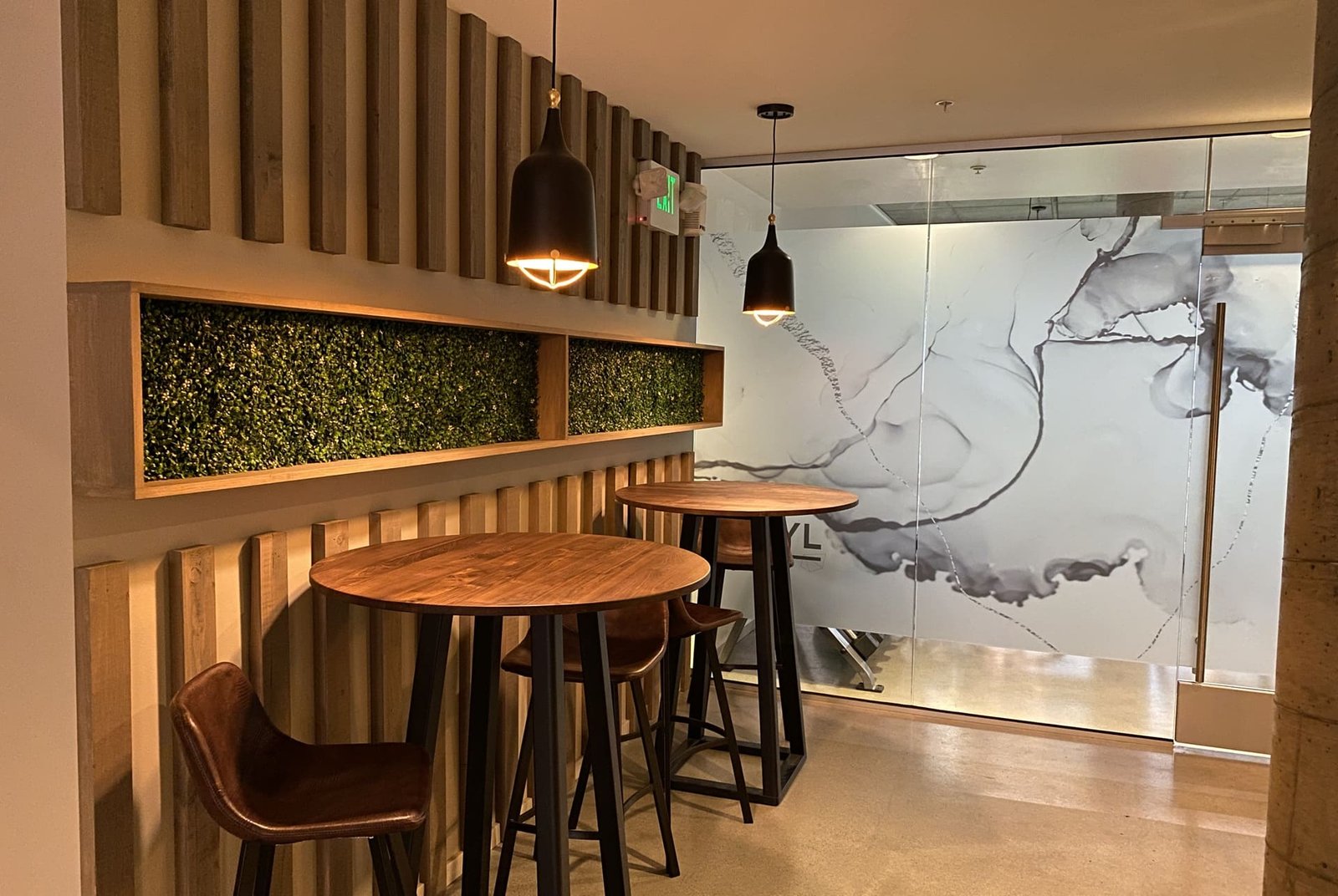
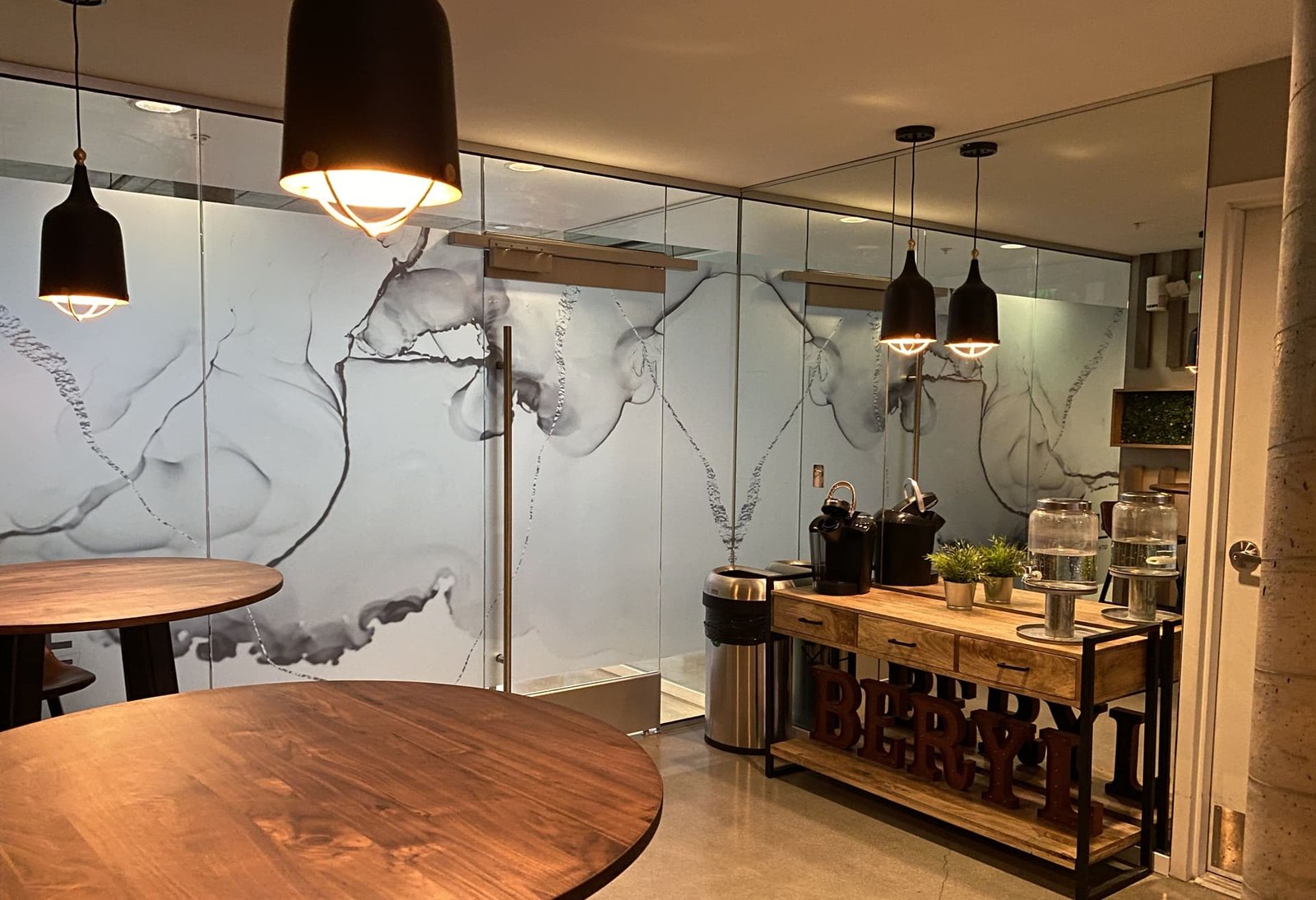
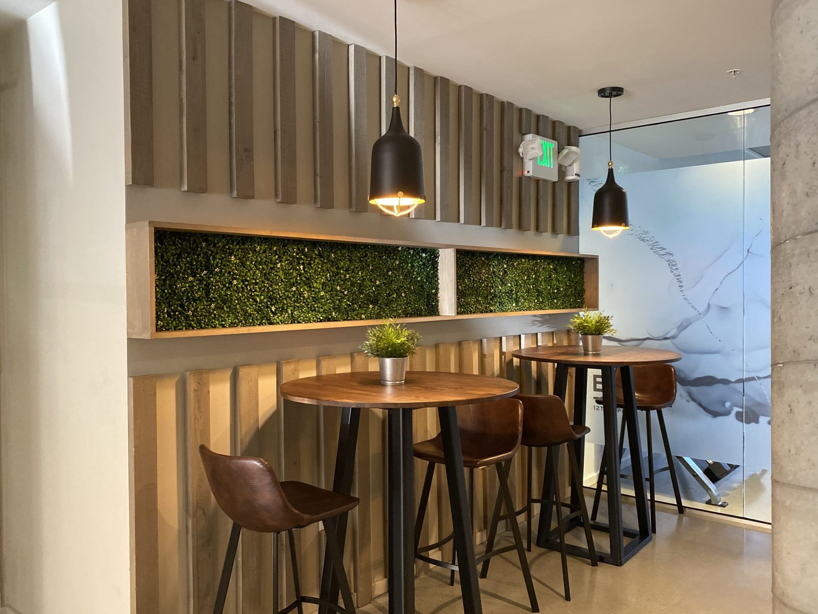
The glass partition connecting the gym to the lounge was a space planning decision. Keeping the gym visually open makes both spaces feel larger. Residents in the lounge can see the gym; residents in the gym see the social space. That connection changes how both rooms are used — the transparency reads as a design feature, not a budget compromise.
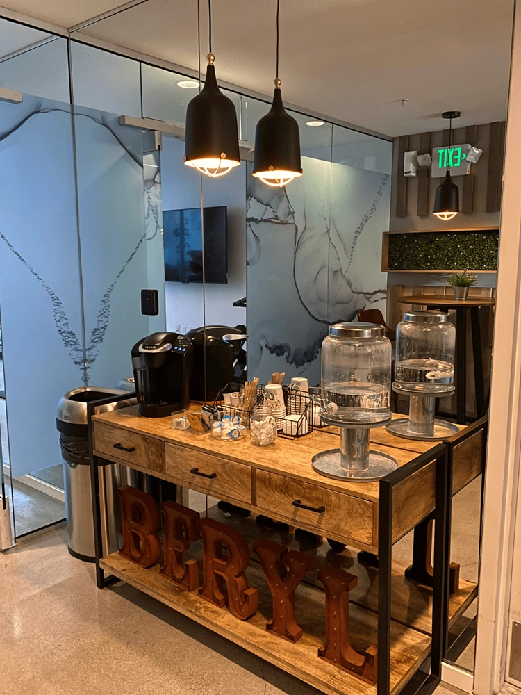
The coffee bar millwork was designed to hospitality standard. Storage below, equipment built in, display above. It reads as an amenity, not a residential kitchen counter with a coffee machine pushed against the wall.
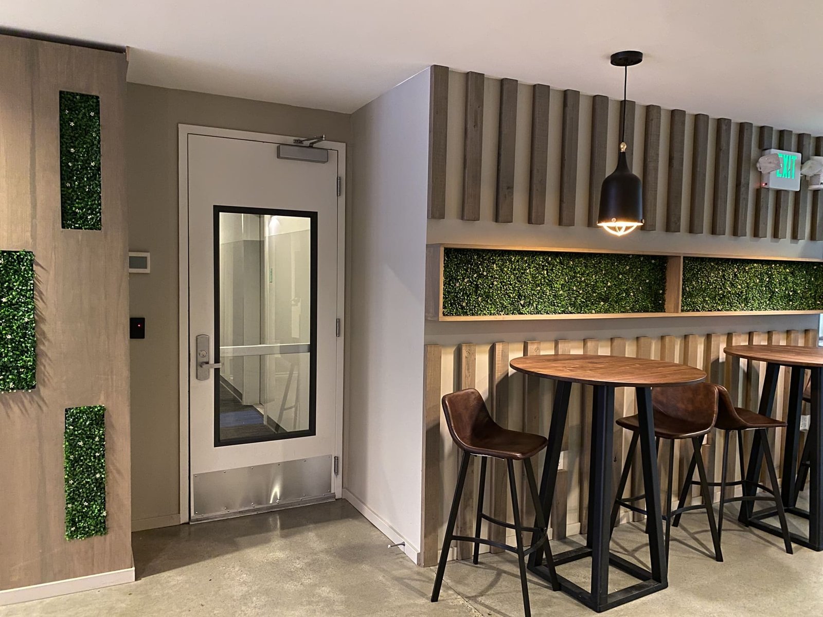
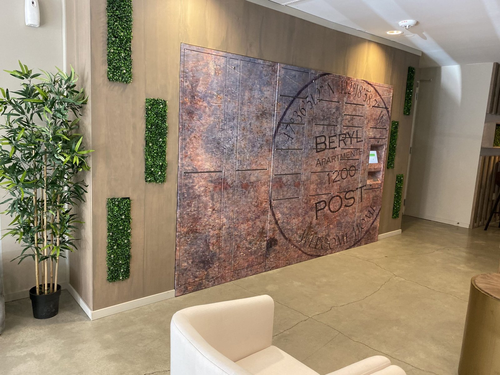
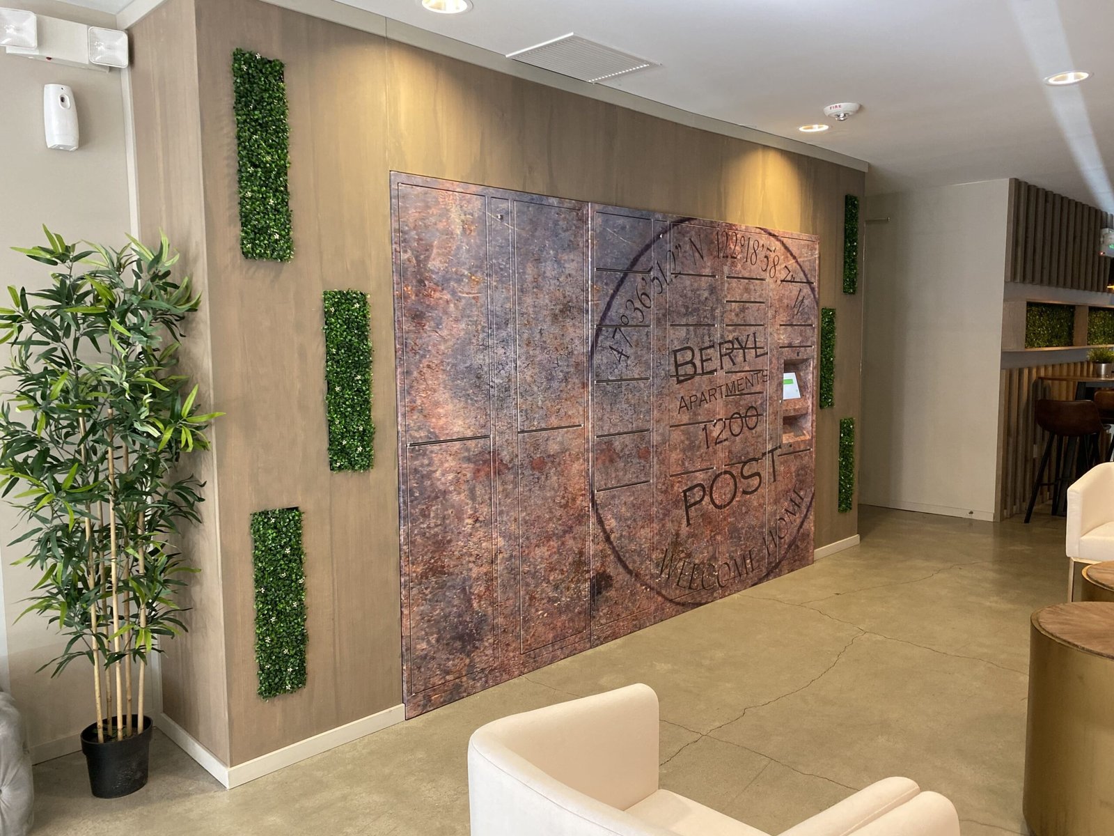
Lighting was layered across multiple types: oversized black dome pendants, caged mini pendants, wall sconces, and a sculptural multi-arm chandelier. The variety brings warmth and visual rhythm to the high ceilings. The vertical wood slat wall behind the seating adds depth, conceals structural columns, and ties the different lounge zones into one refined environment.


Frequently Asked
The work in this portfolio is the standard we hold ourselves to on every project — not just the celebrated ones. We take on a limited number of engagements each year, which means the projects we commit to receive our full attention from the first conversation through the final installation. If you're considering a renovation, a new build, or a full redesign, tell us about your home. We'll tell you honestly whether we're the right fit — and what working together would look like.
Your home should stop you. Every time you walk in.