
Portfolio · Seattle, Washington
The Vermillion Lounge, Seattle
A Seattle living room built around a single commitment: red, and meaning it.
The client wanted a space that made a statement without feeling costumed. Red was on the table from the first conversation — not as an accent, but as the primary move. The challenge was making it livable: a room you could spend an evening in, not just photograph.
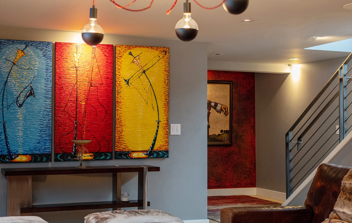
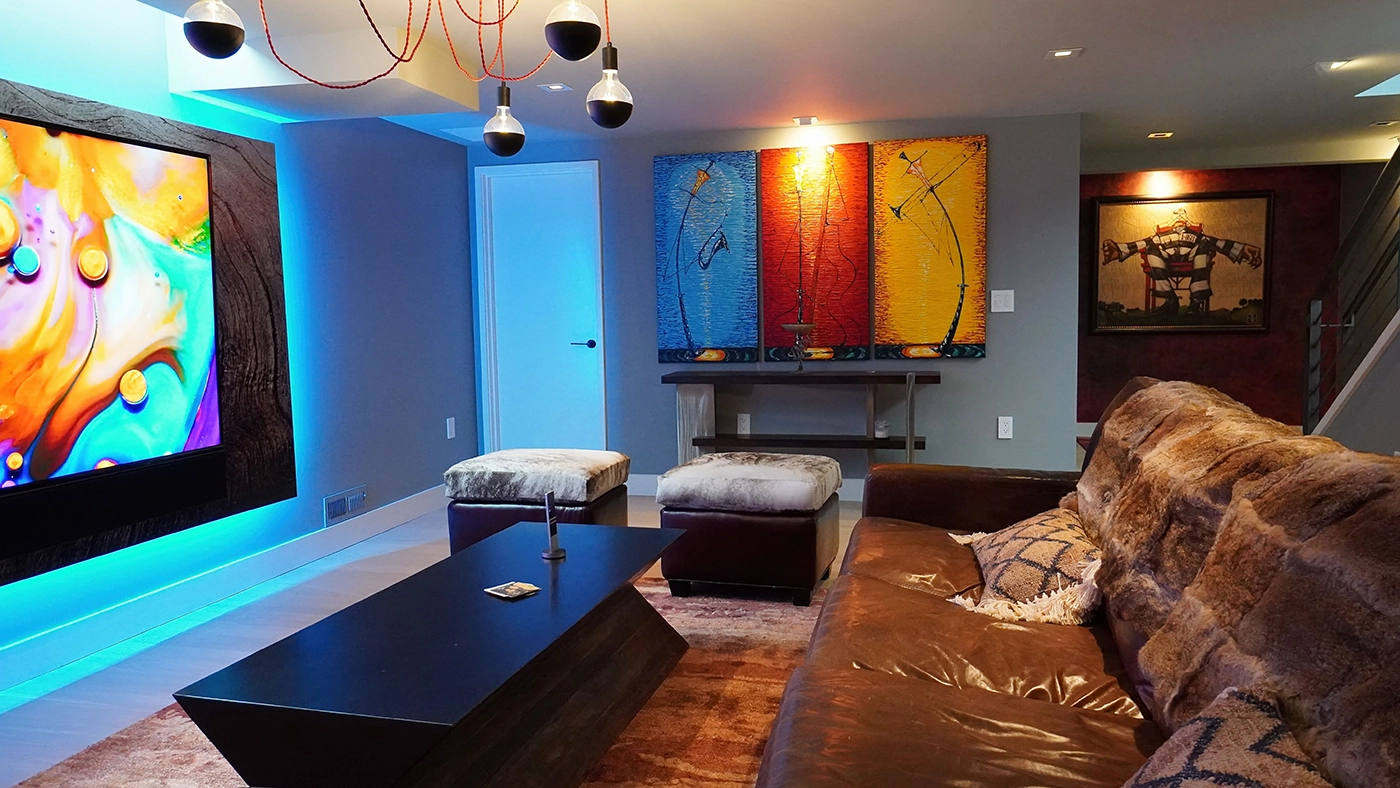
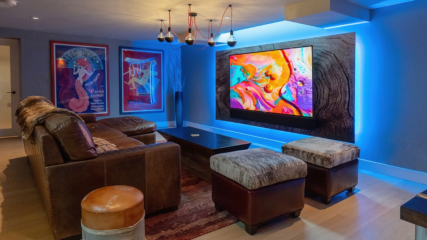
The Vermillion Lounge is the result. Leather seating in warm cognate tones. Industrial lighting that gives the color mass and shadow. Vintage pieces that give the space history. Art that pushes the palette without competing with it.

Designed Around One Commitment
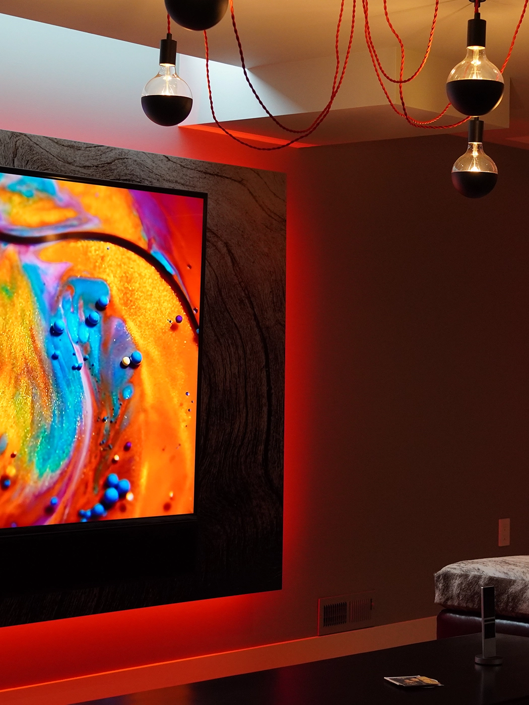
Red at this scale works when it’s grounded. The leather sofa pulls the eye without fighting the wall color. Industrial pendants cast warm pools of light that give the red depth — it reads differently at noon and at 10pm, which was intentional. A room with a strong color has to be calibrated for time of day.
The vintage elements — posters, found objects, a collection built over time — keep the space from feeling like a set. The eclecticism is earned, not styled. Every piece has a reason to be there.
Considering a Project?
The Work Begins With One Conversation
We hold a limited number of consultations each month and are selective about the projects we take on. If you’re ready to discuss yours, we’d like to hear about it.
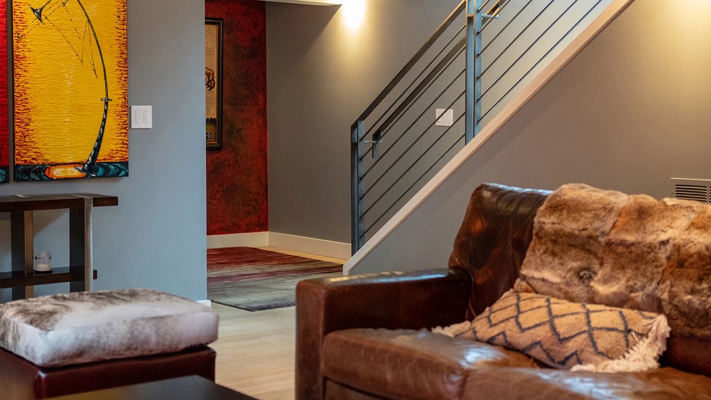
Leather, warmth, and a staircase that frames the room from above.
The Challenge
The Challenge: Making Bold Color Livable
Strong color choices in living rooms fail in two directions: too timid (the color gets diluted until it disappears) or too aggressive (the room becomes exhausting to be in). The brief called for neither — a space where the red was unambiguous but the room was still a place to relax.
The solution was in contrast management. Cool neutrals on the ceiling and trim let the warm tones breathe. The floor stays dark and grounding. Art was selected to complement, not compete — abstract pieces that carry the color conversation without adding competing focal points.

“If you’re going to commit to a color, commit. Half-measures read as indecision.”
Our Design Approach
How We Built the Palette
We started with the leather. Cognac and tobacco tones in the seating established the warm base — the red could read as an intensification of those tones rather than a departure. That relationship is what keeps the room coherent rather than chaotic.
Lighting was spec’d in warm Kelvin ranges throughout. No cool-white sources. Industrial pendants were chosen for their ability to concentrate light — focused pools rather than diffuse ambient. In a room with saturated color, how light falls changes everything.
Art curation was the final layer. The abstract pieces were selected to carry the palette forward without adding literal content that would compete with the room’s energy. The vintage posters function as cultural reference — they give the space a point of view that extends beyond the purely visual.
Location
Seattle, Washington
Project Type
Living Room Interior Design
Style
Eclectic Modern
Palette
Vermillion, cognac, warm neutrals
Key Features
Bold color, vintage curation, industrial lighting
Scope
Full living room design
Common Questions
Frequently Asked
Grounding and contrast. Strong colors need anchor points — a dark floor, neutral ceiling, contained trim — so the color has something to push against. And the furnishings need to relate tonally, not compete. Cognac leather next to red reads as a family; a contrasting cool color next to red creates tension.
Lighting first. A room has to work at different times of day and for different activities. We layer ambient, task, and accent sources so the space can be adjusted — reading light, evening atmosphere, entertaining mode — without requiring a full reconfiguration.
Yes, but cohesion comes from color and material consistency, not stylistic uniformity. If the warm tones carry through — leather, wood, aged metal — pieces from different eras and origins read as part of the same conversation. The eclecticism becomes richness rather than clutter.
Art in a strong-color room needs to complement, not compete. Abstract work tends to succeed — it carries the palette conversation without adding literal content that fights the room’s energy. We curate for tone and scale, not just aesthetic. A piece that’s technically good can still be wrong for the room.
Test it at scale in your actual lighting conditions. A paint swatch looks nothing like four walls. Run a large sample — at minimum a 2×2 foot section — and look at it morning, afternoon, and evening before committing. Bold color rewards confidence but punishes guessing.
The work in this portfolio is the standard we hold ourselves to on every project — not just the celebrated ones.
Begin Your Project
Your home should stop you. Every time you walk in.