Paint Colors for Pacific Northwest Homes in 2026
Choosing paint colors for a Pacific Northwest home is different from choosing them anywhere else. The light here is specific, the architecture tends toward natural materials, and the relationship between the interior and the grey-green landscape outside matters in ways it does not in sunnier climates. Colors that look warm and resolved under California or East Coast light can turn flat, cold, or muddy under the overcast diffuse light of Kirkland, Bellevue, and Seattle. This is where most paint decisions go wrong.
Our Services
Explore our expert interior design, architecture, and custom furniture services to create a space uniquely yours. Let’s start your transformation today!
Get In Touch
If you are looking for a collaborative team that loves your space and is your steadfast design advocate, we’re a fabulous fit for you!
Why Pacific Northwest Light Changes Paint Completely
The dominant light condition in the Pacific Northwest for much of the year is overcast diffuse light. It has no single direction, no strong shadows, and a blue-grey cast. Colors that work in this light need warmth built in because the light will not supply it. A cool grey that reads as sophisticated in a brightly lit space will read as cold and flat in an overcast Pacific Northwest room. A white that photographs cleanly can feel institutional in daily conditions.
Summer light in the PNW is different again. Bright, direct, and clear from June through early September. Rooms that work year-round here need to hold their warmth in grey conditions without washing out in clear summer light. That is the constraint paint selection has to solve.
Colors That Perform Well Year-Round in This Region
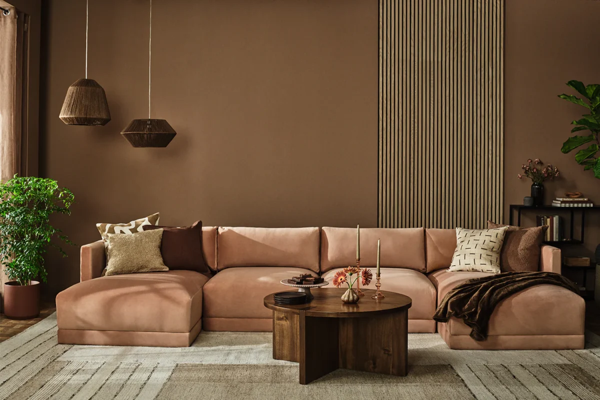
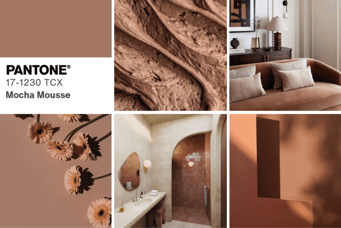
Warm neutrals with yellow or red undertones respond best to the quality of Pacific Northwest light. Greige families that lean toward the warm side, taupes with a clay or amber note, and off-whites with cream undertones rather than pink or blue all tend to look resolved across the range of lighting conditions this region produces. The key word is undertone. The dominant hue matters less than what is underneath it.
Specific colors that work consistently in PNW homes include warm greiges in the LRV 55-70 range, soft sage with significant grey in it, muted dusty greens that echo the landscape without competing with it, and ochre-adjacent warm yellows used as accent rather than dominant color. These are not universal rules. They are patterns that show up repeatedly in spaces that feel right here.
How to Test Paint Colors in Pacific Northwest Conditions
The standard advice to test paint colors in different lights applies everywhere, but in the Pacific Northwest it requires specific attention to grey-sky conditions. A color sample assessed only on a sunny afternoon will mislead you. The same sample needs to be observed on an overcast morning and again at the grey midday that is typical from October through April.
Large samples matter. A 12-inch swatch reads differently from the 3-inch rectangle on a paint chip. If you are committing to a color across a significant surface, test it at a size where you can assess the actual room impact. Painting a two-foot-by-two-foot area of the actual wall and observing it across three different days is more reliable than any other method.
The Indoor-Outdoor Color Relationship in PNW Homes
Pacific Northwest architecture frequently creates a visual connection between interior spaces and the landscape outside. Large windows framing treeline, water, or the grey-green hillside. In homes with strong indoor-outdoor connection, the interior palette needs to read coherently against whatever is outside the window. Colors that fight the landscape create a visual tension that makes a room feel restless even when nothing else is wrong.
Warm neutral interiors with organic material accents read as extensions of the landscape rather than contrasts to it. Stone, wood, linen, and warm metals echo the environment outside. Paint colors in the warm greige and muted green range reinforce that connection rather than interrupting it.
What to Avoid in Pacific Northwest Interiors
Cool greys without warm undertones read as cold in grey Pacific Northwest light. Bright whites with blue or pink undertones can look clinical. Highly saturated colors that work beautifully in spaces with strong directional sunlight often feel overwhelming under flat diffuse light because the light does not modulate them the way directional sunlight does.
Stark contrasts between very dark and very light surfaces in low-light conditions can also create visual heaviness. This does not mean avoiding contrast, but it means achieving it through material and texture variation rather than pure value contrast between light and dark painted surfaces.
Using Color Across a Whole Home
Color coherence across a floor plan matters more in Pacific Northwest homes than in spaces with abundant natural light. In bright conditions, each room can hold its own palette and the transitions feel manageable. In lower-light conditions, abrupt color shifts between adjacent spaces create visual fragmentation. A palette that shares undertones across rooms, while varying in depth and application, produces homes that feel resolved when you move through them.
The practical approach is to establish one dominant neutral, one medium-value supporting color, and one accent before making any room-by-room decisions. Testing all three together in your actual light before committing prevents the accumulation of individually reasonable choices that add up to something incoherent.

Frequently Asked Questions
Written by
Ariana Adireh Anderson
You might also like
What Do Interior Designers Do?
Why Choose Ariana Designs & Interiors as Your Interior Decorator?
Why Ariana Designs & Interiors Outshine the Competition
Why Ariana Designs & Interiors Is the Best Interior Design Firm for Your Luxury Home
Enhance Your Home with Expert Interior Design
Elevate Your Living Space with Expert Home Interior Design
Unlocking the World of Interior Design Styles
Elevate Your Space with Inspired Office Design
Top Bathroom Design Services in Kirkland, Bellevue, and Mercer Island
Why Ariana Designs & Interiors is a Top Design Build Firm
Embrace Luxury Design with Timeless Luxury Furniture
Crafting Your Dream Home with Precision and Style
18 Lessons Homeowners Must Learn Before Remodeling
Mastering Building Code Compliance in King County
Check our projects in Houzz
Timeless Luxury: Bringing a European-Inspired Kitchen to Life
A Floating Home Designed for Elegance and Artistic Living
Luxury Interior Design: Harmonious Dining Room with Indoor-Outdoor Elegance
Chic Commercial Seating Area: A Modern Space in Bellevue
Dynamic Interior Design for Commercial Spaces
Modern Bellevue Home Exterior Design
Get In Touch
If you are looking for a collaborative team that loves your space and is your steadfast design advocate, we’re a fabulous fit for you!