Sumner, Fully Considered
Small space design is harder than large space design — every piece has to earn its place twice.
The Sumner apartment brief was tight in every sense: 650 square feet, one primary living zone, and a client who wanted the space to feel curated rather than compact. No compromise furniture, no visual clutter, nothing that didn’t belong. The result had to live like a larger space while operating within its actual footprint.
The approach: select fewer pieces, select them better. A tufted leather sofa with presence. Blue armchairs that hold the corner without shrinking it. A geometric rug that anchors the zone without overwhelming it. Two chandeliers selected for their contribution to both light and atmosphere. Every piece pulls weight.
Designed for Maximum Presence
In a small apartment, furniture scale is counterintuitive. The instinct is to go small — compact pieces, less visual mass. But undersized furniture in a compact space reads as cheap and tentative. The correct move is to select fewer pieces with genuine presence — pieces that anchor the room rather than apologize for being in it.
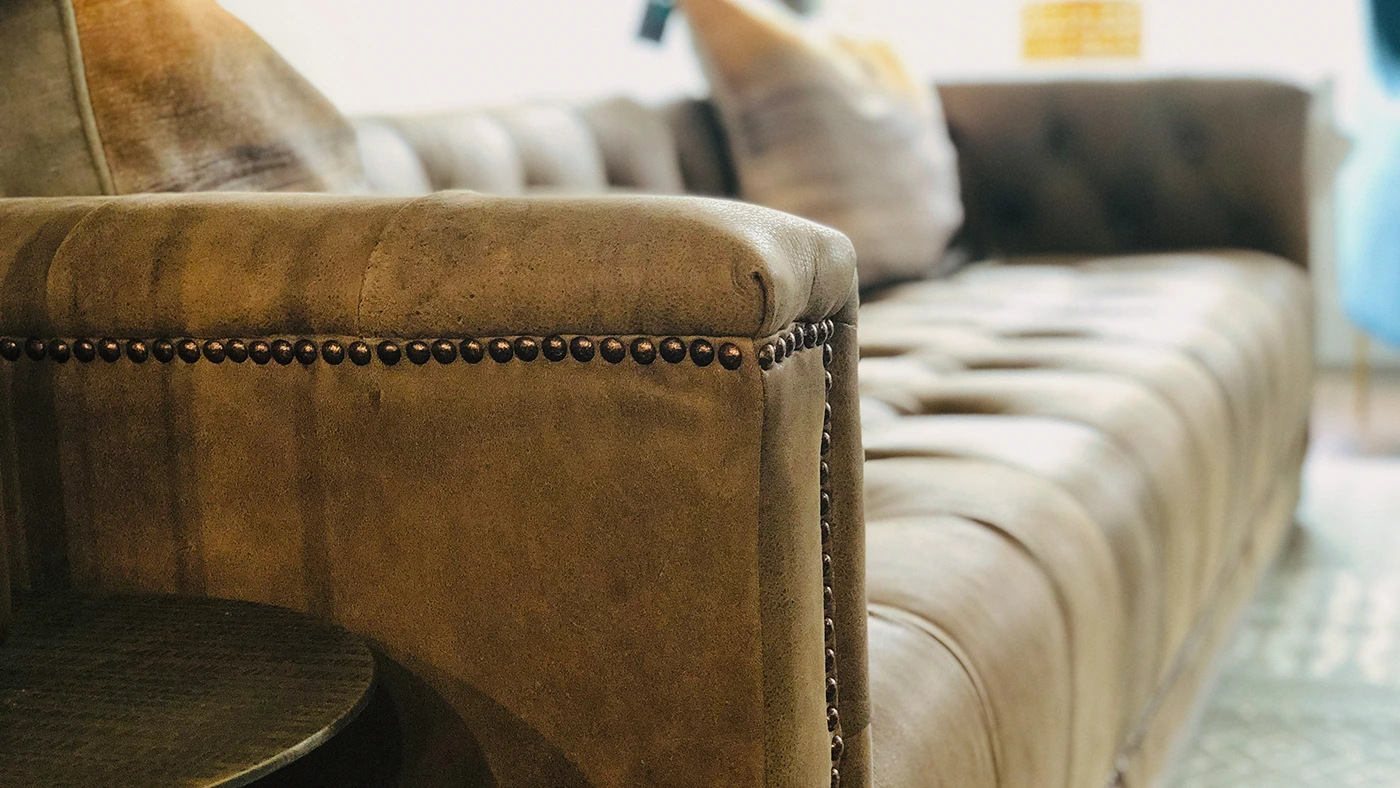
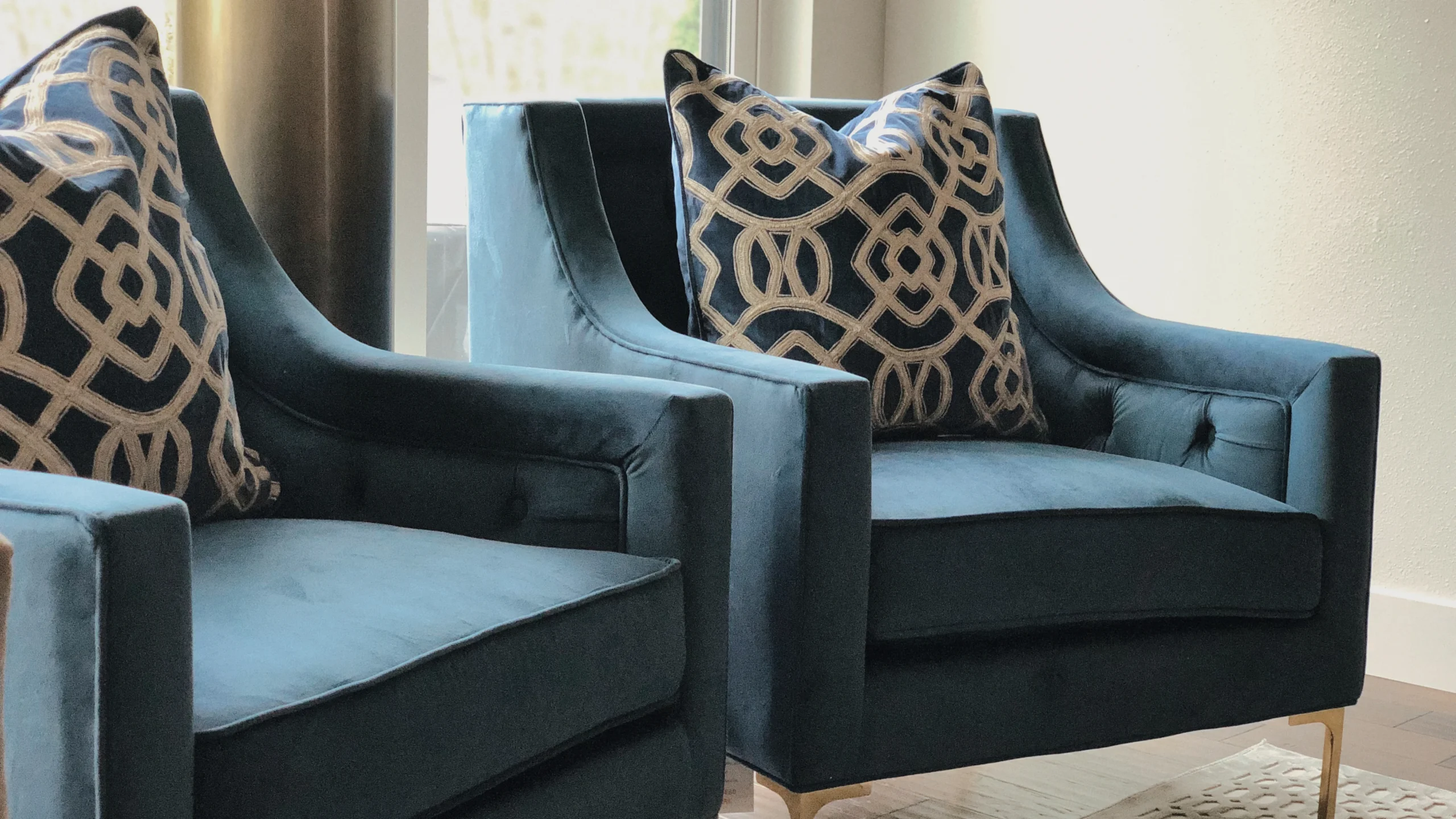
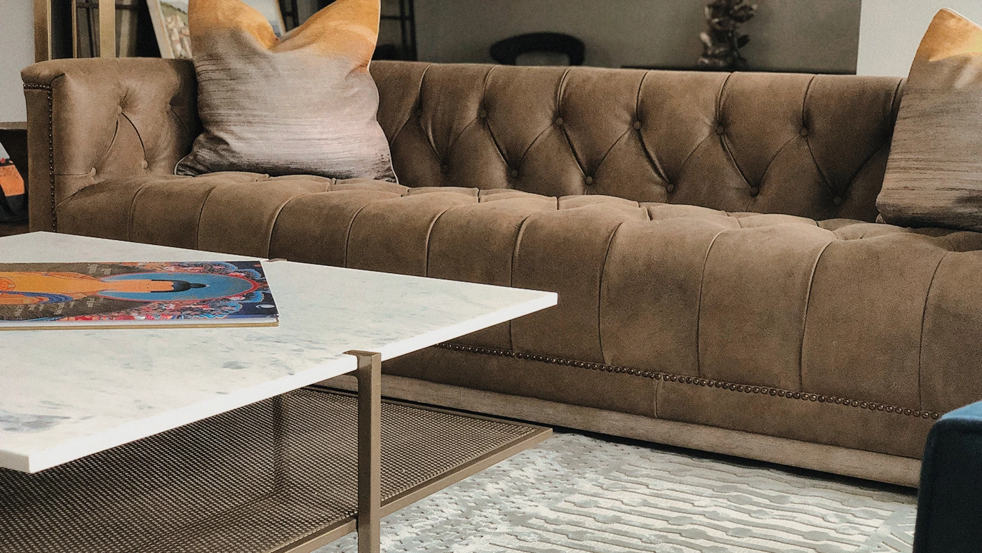
The tufted leather sofa is the room’s primary statement. Its scale is deliberate: it fills the living zone appropriately, creates a defined seating area, and contributes visual weight that grounds the space. The armchairs in blue hold the opposite corner — their color is the room’s one strong move, held in check by the neutral palette everywhere else.
The Work Begins With One Conversation
We hold a limited number of consultations each month and are selective about the projects we take on. If you’re ready to discuss yours, we’d like to hear about it.
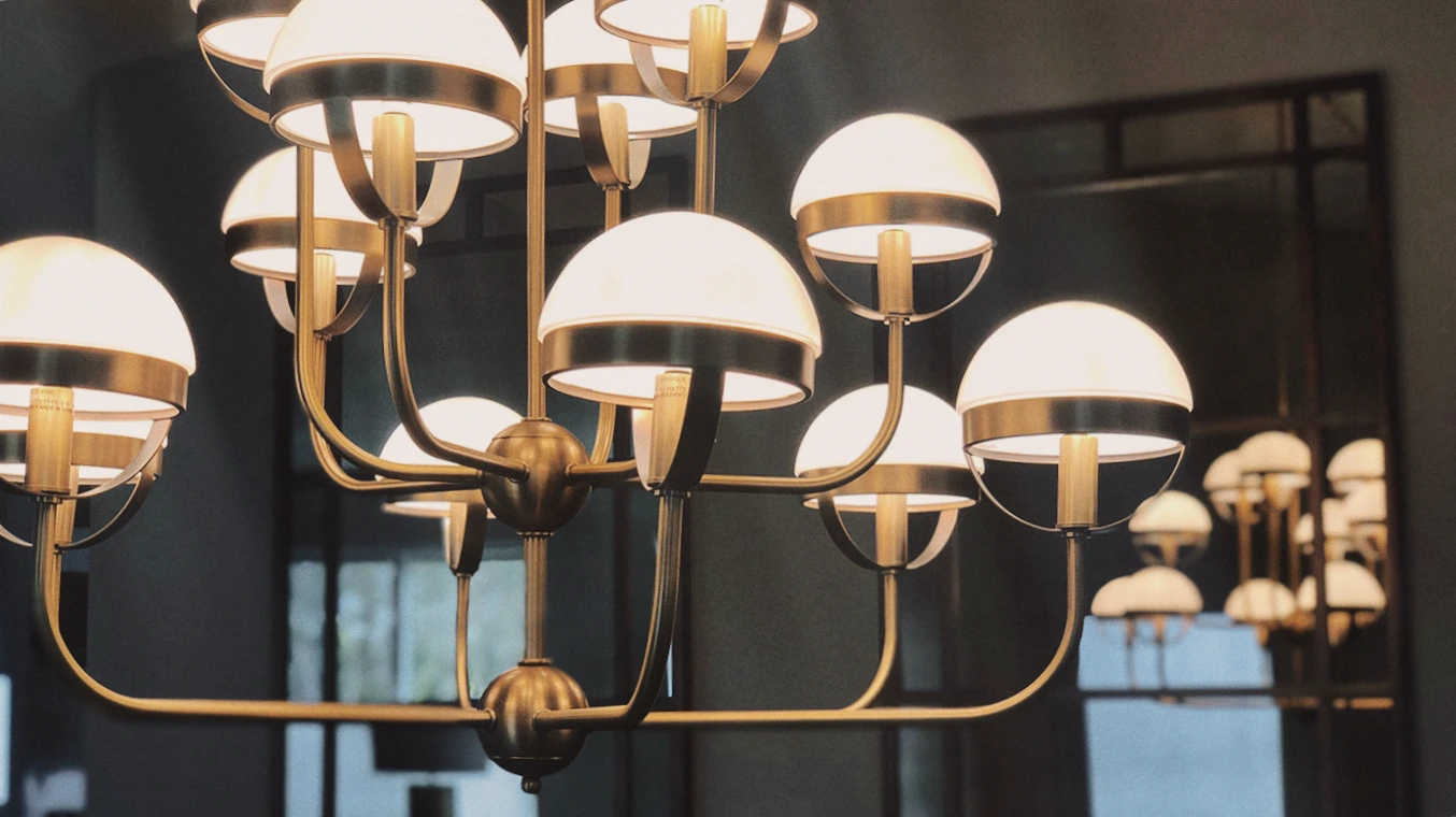
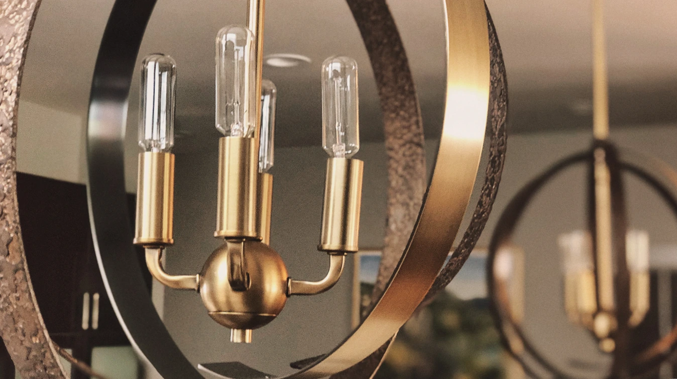
Lighting chosen as much for its sculptural contribution as its lumens.
The Challenge: Editing Without Losing
The hardest part of small space design isn’t what you add — it’s what you leave out. Every piece that doesn’t earn its place creates visual noise that makes the space feel smaller. The editing process is where the design actually happens: ruthless about inclusion, generous with quality.
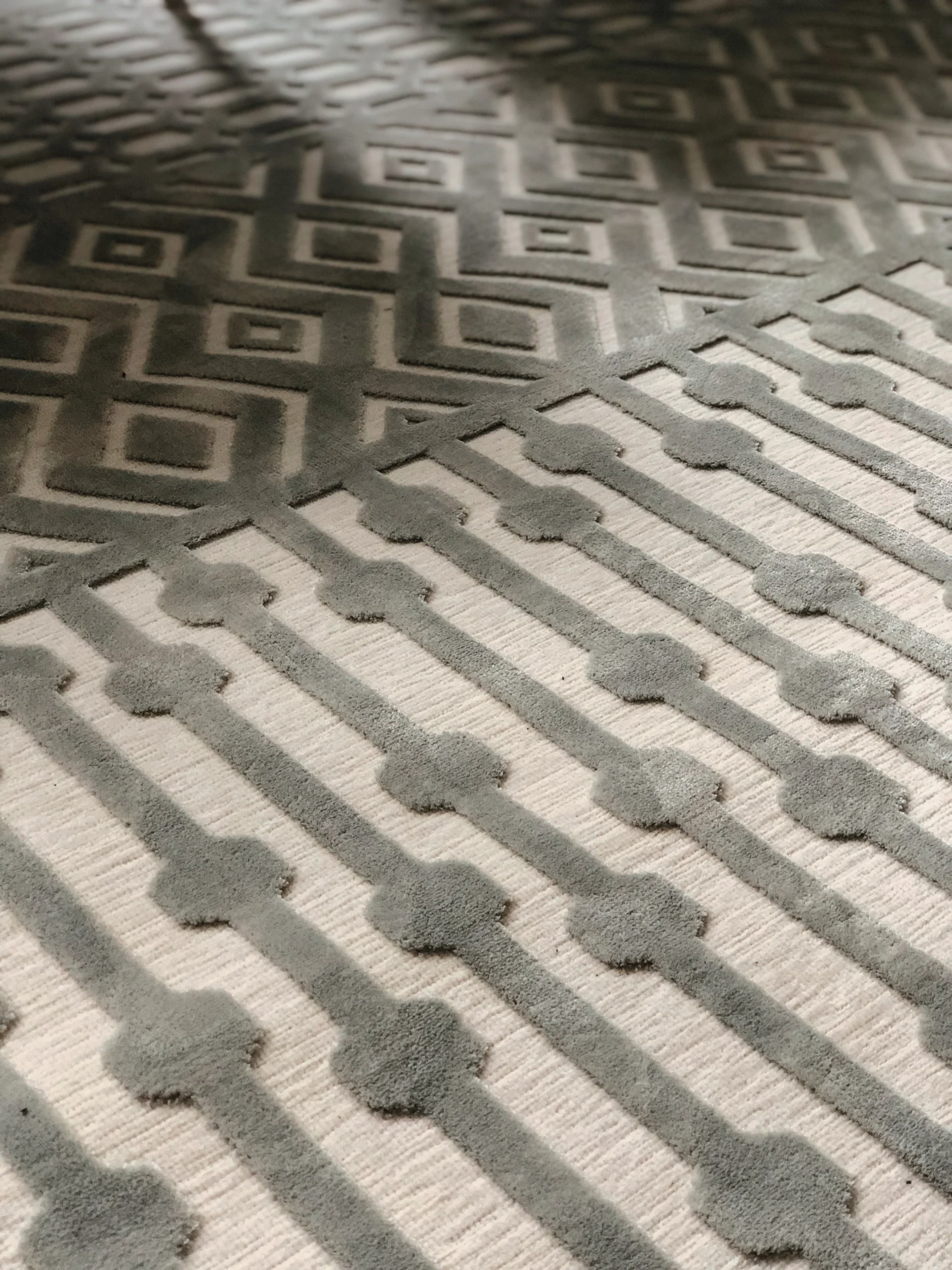
Pattern introduces risk in a compact space. The geometric rug was selected for its scale — large-pattern, not small-repeat — because large-scale pattern in a small room expands rather than contracts the visual field. The same principle applies to the chandelier selections: sculptural objects at ceiling height draw the eye upward and effectively add perceived volume.
“In a small space, every piece is either carrying the room or costing it — there’s no neutral.”
How We Curated the Space
Selection started with the sofa — the room’s functional and visual anchor. Once the scale, material, and tone of the sofa were confirmed, everything else was built in relation to it. The armchairs for color contrast. The coffee table for proportion. The rug for zone definition.
Lighting was spec’d in two registers: ambient and sculptural. The illuminated glass chandelier provides even ambient light while contributing visual interest at ceiling level. The gold Edison chandelier adds warmth and a vintage-modern contrast that keeps the room from reading as too uniform.
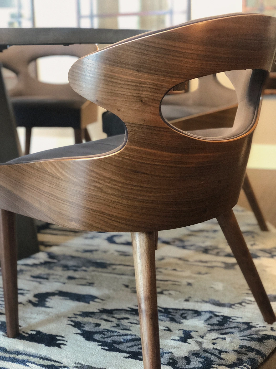
The wooden chair at the dining position bridges the gap between the living zone and the kitchen entry — a transitional piece that serves both zones spatially while contributing its own material note (natural wood against the upholstered pieces in the main living area).
Frequently Asked
The work in this portfolio is the standard we hold ourselves to on every project — not just the celebrated ones.Your home should stop you. Every time you walk in.