
Dark & Dramatic: A Kitchen in Contrast
A Medina kitchen built around the contrast that makes dark cabinetry work — and the layout that makes it function.
Dark cabinetry is a commitment. In a Medina home where the kitchen is used seriously, the material palette needed to deliver on the luxury standard while making the room genuinely pleasant to work in. That requires the right countertop pairing, the right lighting, and a floor plan that supports how a kitchen at this level actually gets used.
The dark wood cabinetry was the decision made first. White marble was always going to be the countertop. Everything else — the hardware tone, the floor format, the appliance integration — followed from those two choices.
Built Around Two Material Decisions
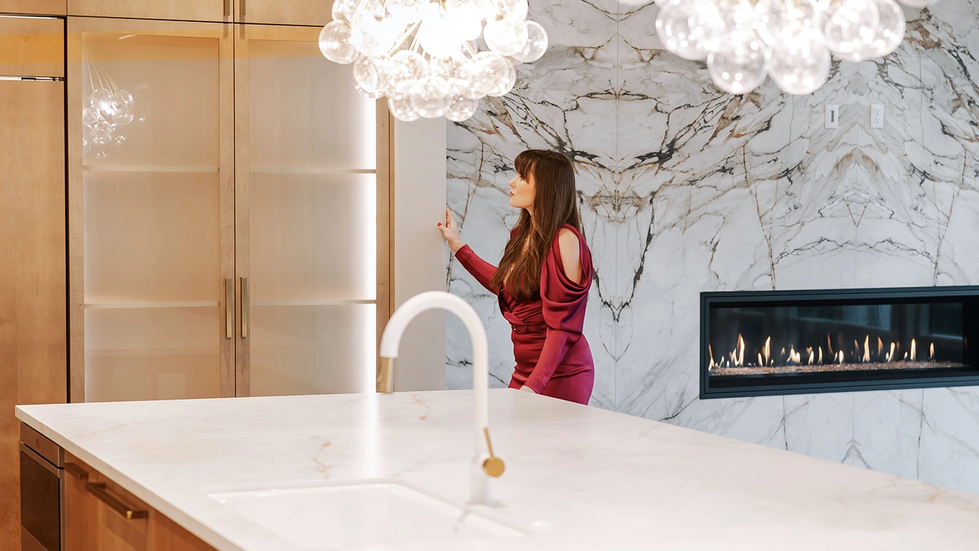
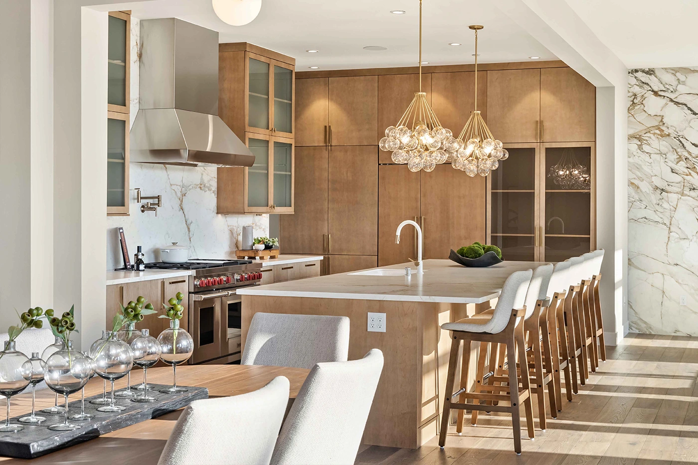
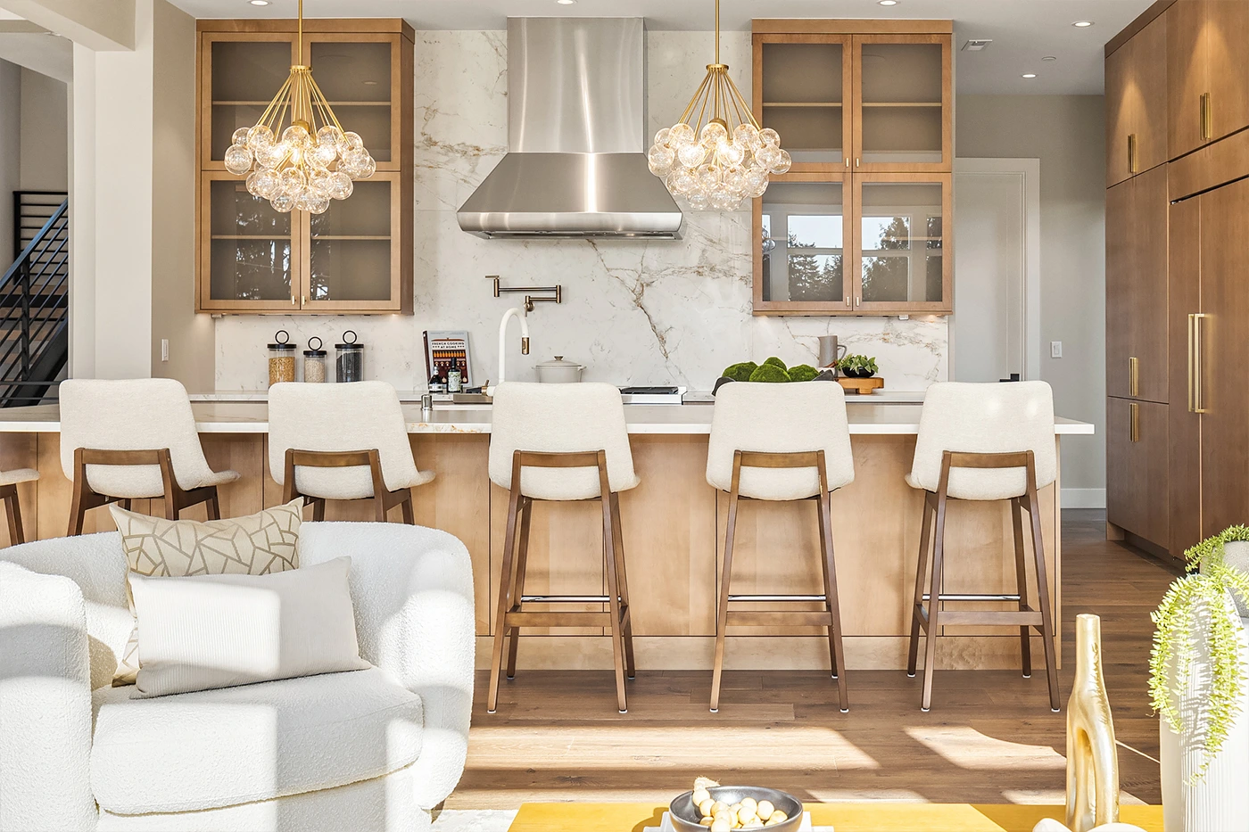
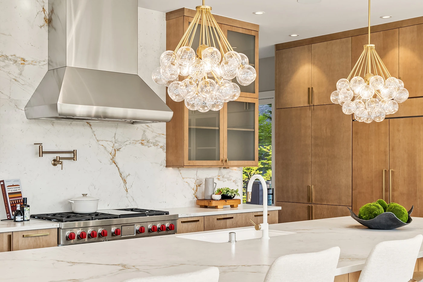
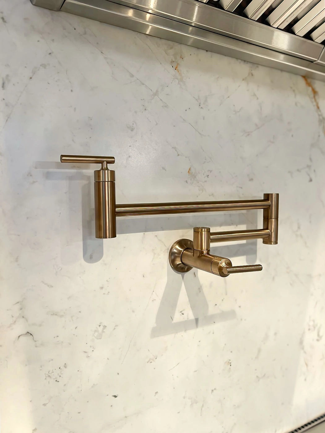
Dark wood cabinetry runs throughout. The profile is clean-lined and contemporary, with dual-tone hardware that introduces a warm metallic finish at the pulls and faucet without switching the entire palette. White marble spans the full counter run — the veining provides visual movement that prevents the surface from reading flat or clinical against the dark cabinets below.
Large-format tile on the floor maintains visual continuity. Smaller formats would interrupt the sightlines that make the kitchen feel open. Large-format tile runs without grout interruption and reads as a single plane. Appliance integration was handled with panel-ready specifications throughout — the kitchen reads as cabinetry, with appliances present but invisible as separate objects.
The Work Begins With One Conversation
We hold a limited number of consultations each month and are selective about the projects we take on. If you’re ready to discuss yours, we’d like to hear about it.
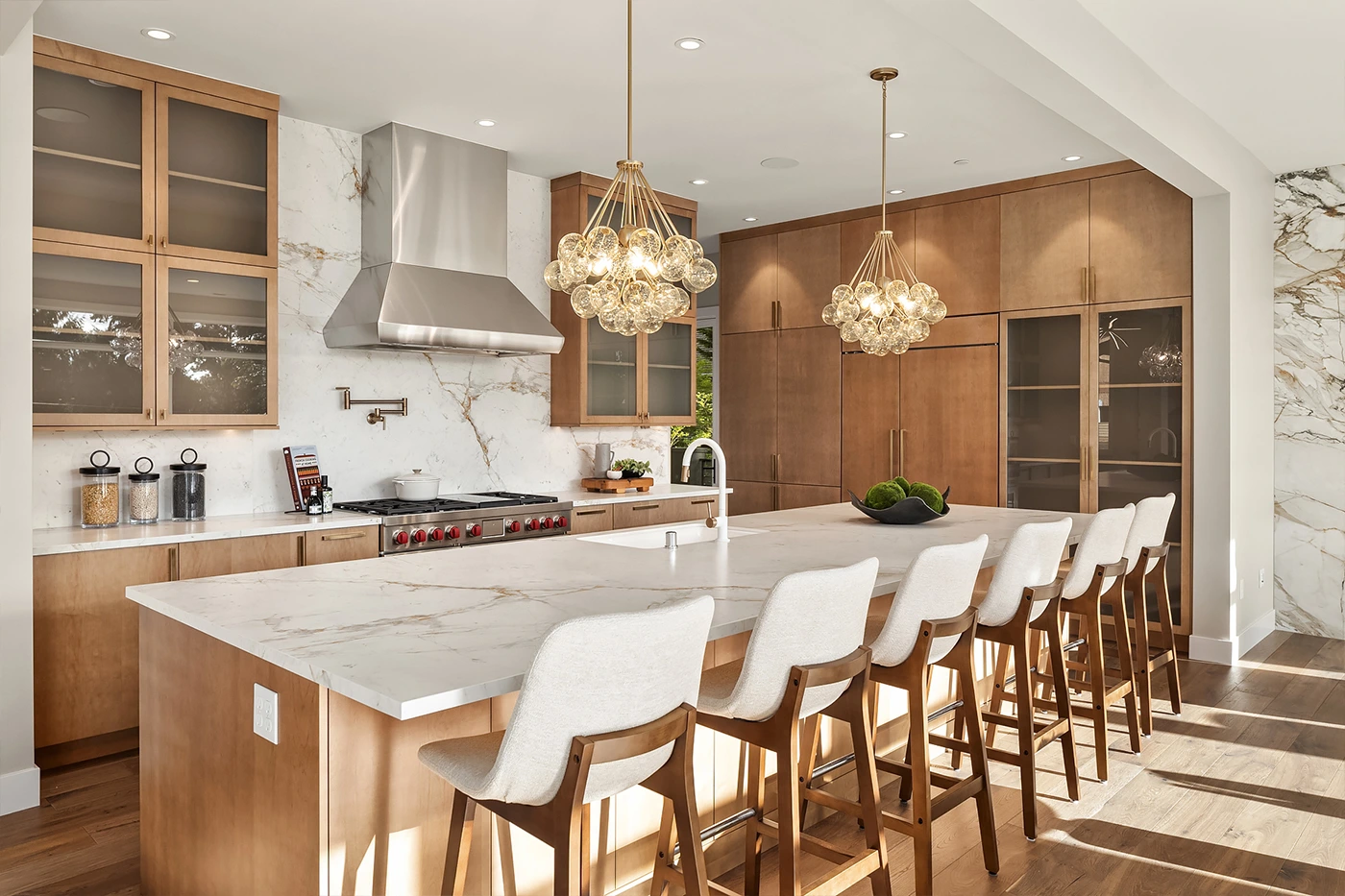
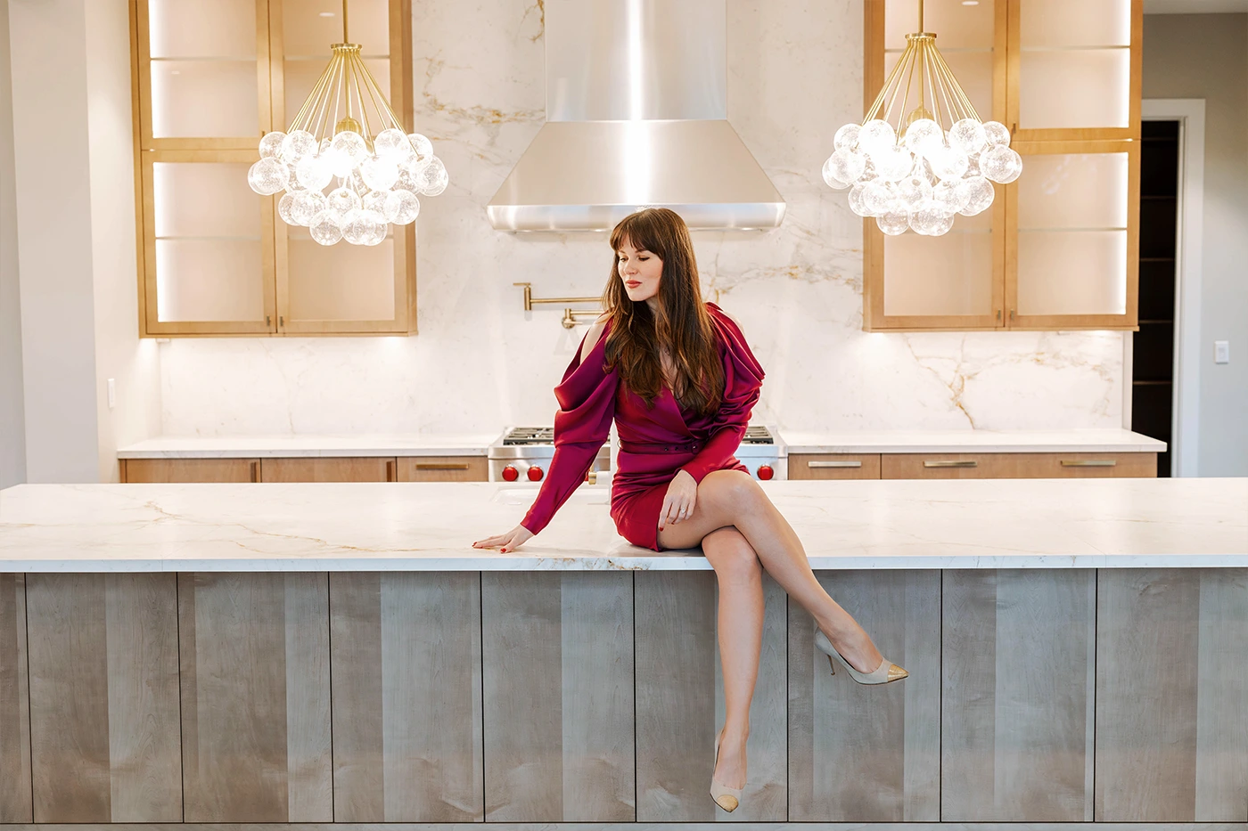
Dark wood cabinetry and white marble countertop: two materials chosen specifically for how they work against each other.
The Challenge Was the Countertop
Dark cabinetry without the correct countertop pairing reads as heavy. The wrong counter — a dark stone, a grey quartz — closes the kitchen down and makes the space feel smaller than it is. White marble against dark wood creates the contrast that makes dark cabinetry dramatic rather than oppressive.
The floor plan also needed attention. A kitchen in a home at this standard gets used by people who cook seriously. The workflow — the distance and relationship between range, sink, and refrigerator — had to be correct before the aesthetic decisions could matter.
“The contrast is the design. Not competing materials — materials chosen for how they work against each other.”
How We Handled the Details
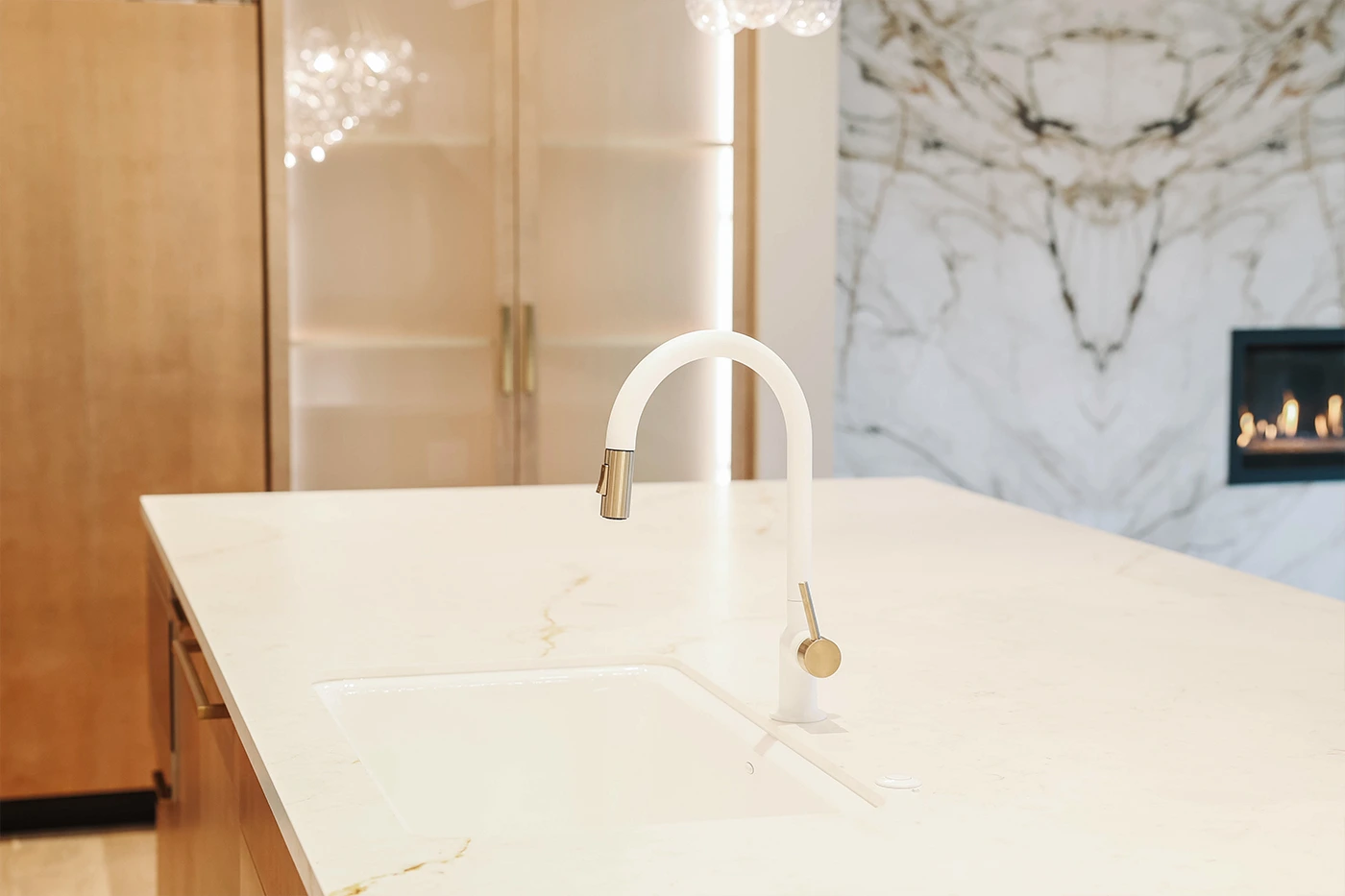
Dual-tone hardware introduces a warm metallic finish at the pulls and faucet — a decision that sits between the dark cabinetry and the white marble without committing fully to either tone. It provides a third element that transitions the palette rather than interrupting it.
Panel-ready appliance specifications were non-negotiable. A kitchen at this level should not read as a showroom for appliance brands. Panel-ready integration means every appliance faces inward toward the cabinetry composition and disappears into it. The kitchen reads as a designed space, not as a collection of products.
The kitchen triangle — the spatial relationship between sink, range, and refrigerator — was resolved in the plan before material decisions were finalized. A kitchen that looks right but doesn’t work correctly is a design failure. The workflow was established first.
Frequently Asked
The work in this portfolio is the standard we hold ourselves to on every project — not just the celebrated ones. We take on a limited number of engagements each year, which means the projects we commit to receive our full attention from the first conversation through the final installation. If you’re considering a renovation, a new build, or a full redesign, tell us about your home. We’ll tell you honestly whether we’re the right fit — and what working together would look like.Your home should stop you. Every time you walk in.