New Face Forward, Hidden Oaks
A leasing office facade that had to do two things simultaneously: reflect the community’s identity and convert the prospect who walks through the door.
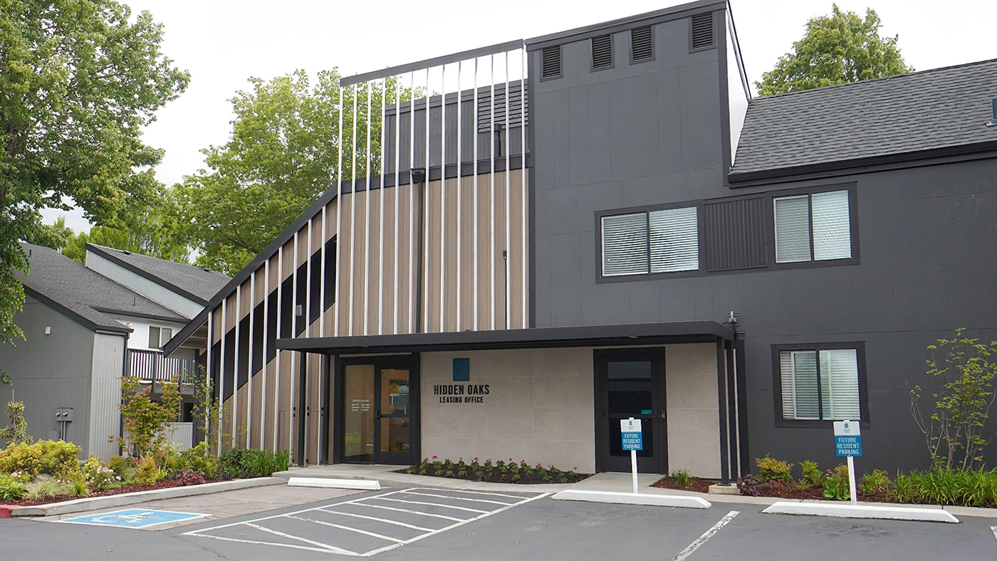
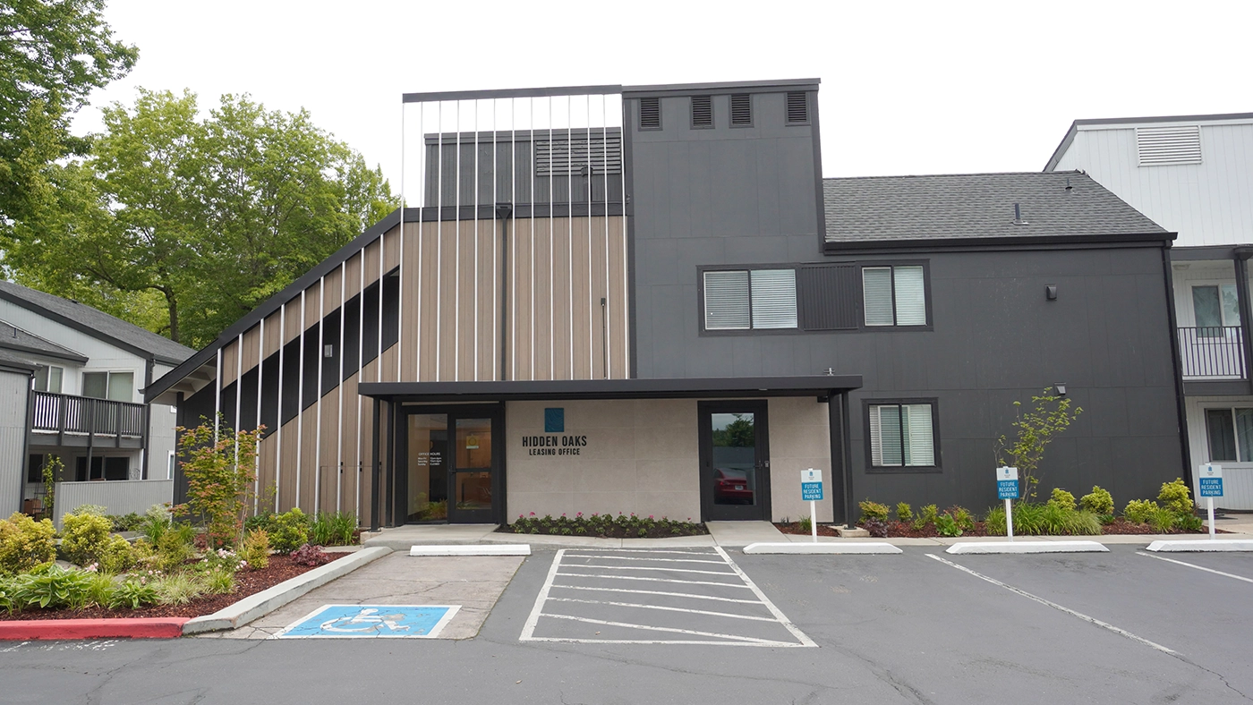
The Hidden Oaks leasing office facade brief was straightforward in its goal and demanding in its execution. The existing exterior communicated nothing particular about the community inside — it was generic multifamily, indistinguishable from the next building on the street. The brief: make it mean something.
The redesigned facade uses a language of wooden panels, clean horizontal lines, and integrated greenery that speaks to the community’s character — natural, warm, considered. From the exterior, a prospect knows something about what they’re about to walk into before they open the door.
Designed to Convert and Communicate
A leasing office exterior has a dual audience. The prospect seeing it for the first time needs to read the community’s quality immediately — the facade is the first pitch, before any conversation happens. The resident who passes it daily needs it to feel like it belongs, like it reflects the community they chose.
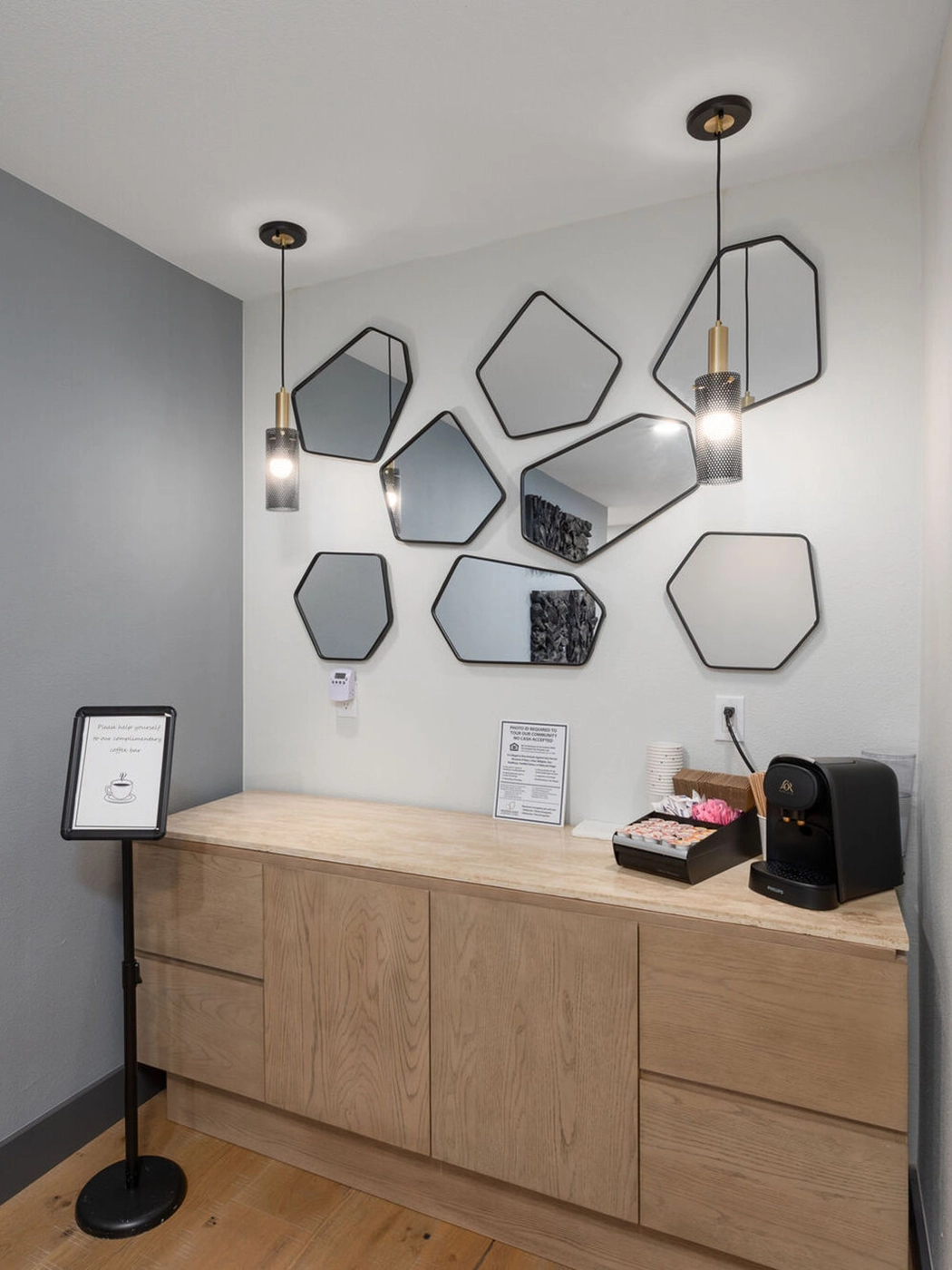
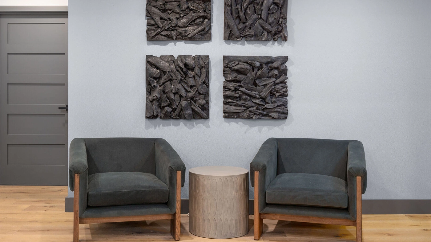
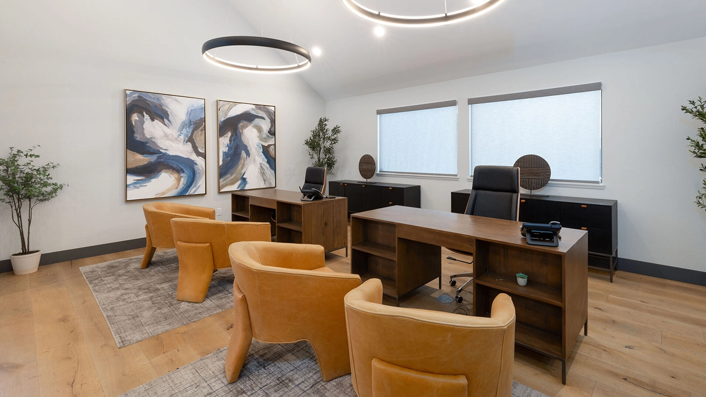
The interior of the leasing office was redesigned in concert with the exterior. The reception area, the seating zones, the office space behind — each is part of a coherent arrival sequence. Walking from the facade through the entry into the interior should feel like one continuous design statement.
The Work Begins With One Conversation
We hold a limited number of consultations each month and are selective about the projects we take on. If you’re ready to discuss yours, we’d like to hear about it.
Wooden panels, clean horizontal lines, and integrated greenery — a facade that communicates before the door opens.
The Challenge: Making Generic Memorable
Leasing office exteriors in multifamily housing are typically afterthoughts — designed to code, then landscaped minimally and left. The challenge at Hidden Oaks was to transform an exterior that had no distinct identity into one that communicated the community’s character clearly enough to affect leasing outcomes.
The interior redesign had to follow the exterior’s lead — or the prospect would experience a disconnect between the promise of the facade and the reality inside. The design process ran both simultaneously, ensuring the material palette and design language were continuous from exterior to interior.
“A facade is a promise. The interior either keeps it or breaks it.”
How We Reinvented the Face
The exterior redesign started with a material audit of the existing facade and a competitive analysis of comparable leasing offices in the submarket. Understanding what the baseline was — and what the best nearby competition looked like — defined the target clearly.
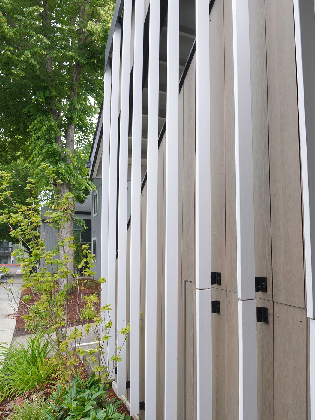
Wooden panels were chosen as the primary exterior element because they translate well at multiple scales: they read at street distance as a warm, natural facade; they hold up at pedestrian scale as a considered material detail. The horizontal banding creates visual interest without complexity.
Integrated greenery at the entry — planting beds flush with the building line, climbing elements, and potted specimens at the threshold — provides the softness that a hard facade material alone can’t deliver. The entry sequence is framed by plant material, which makes the approach feel intentional at human scale.
Frequently Asked
The work in this portfolio is the standard we hold ourselves to on every project — not just the celebrated ones.Your home should stop you. Every time you walk in.